COMO Marketing has been crafting compelling campaigns for decades, evolving alongside the marketing landscape. From the impact of print to the power of digital, our experienced team knows how to get your message seen and heard. We leverage that rich history to create fresh, effective strategies that deliver results across all platforms. Let us put our expertise to work for you.
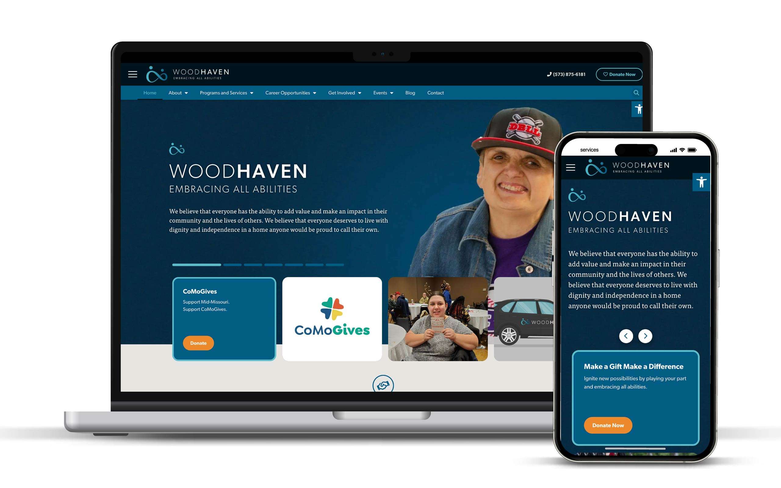
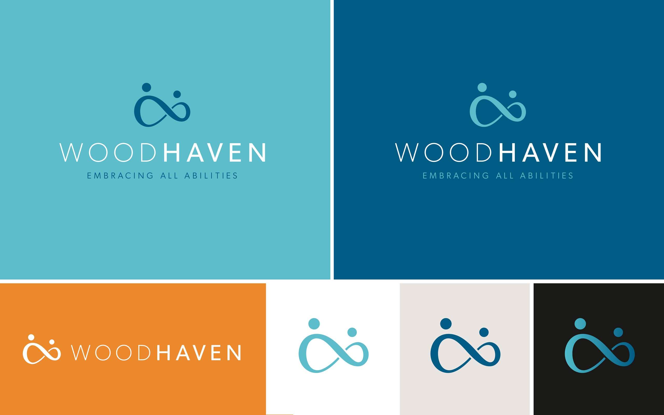
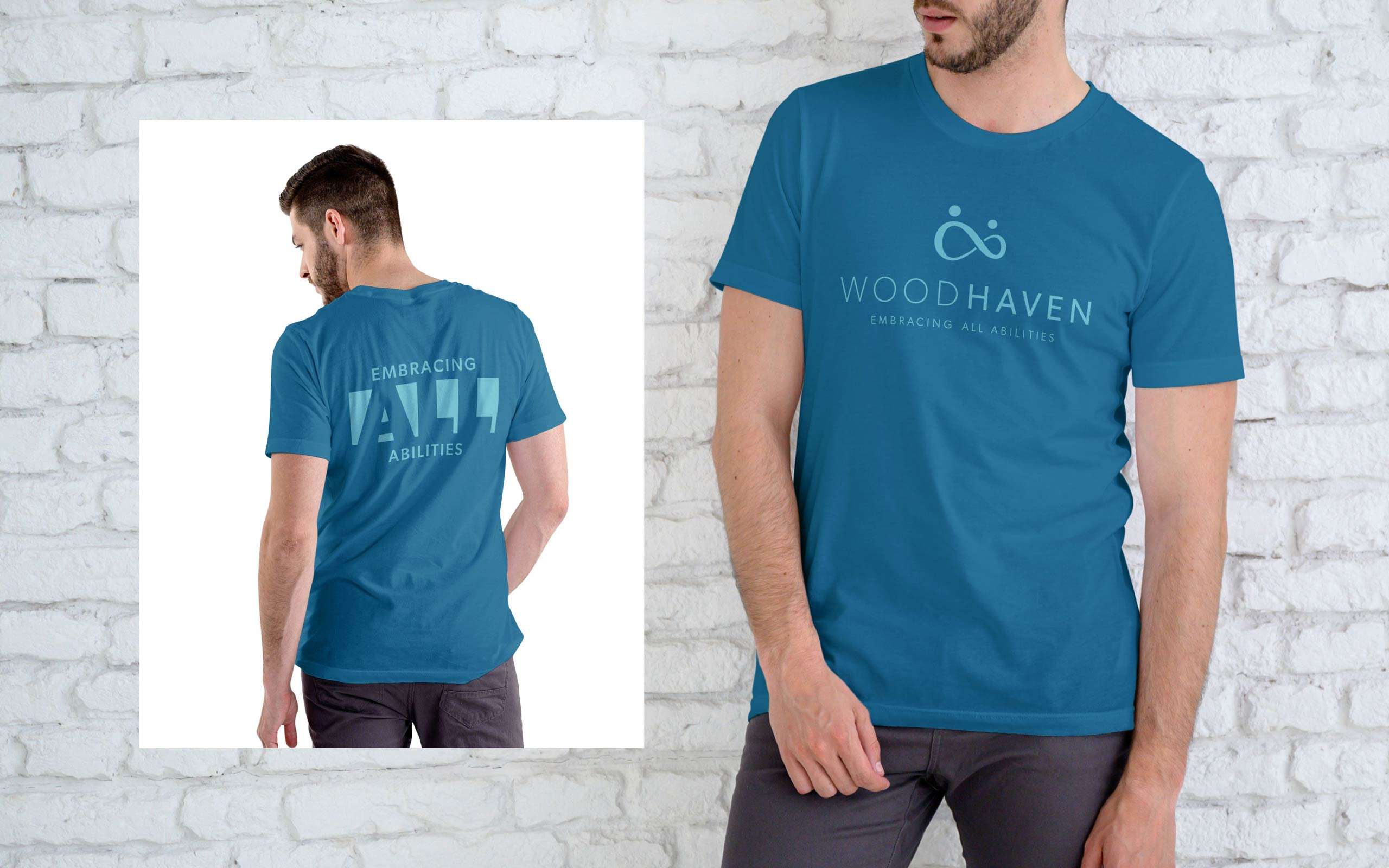
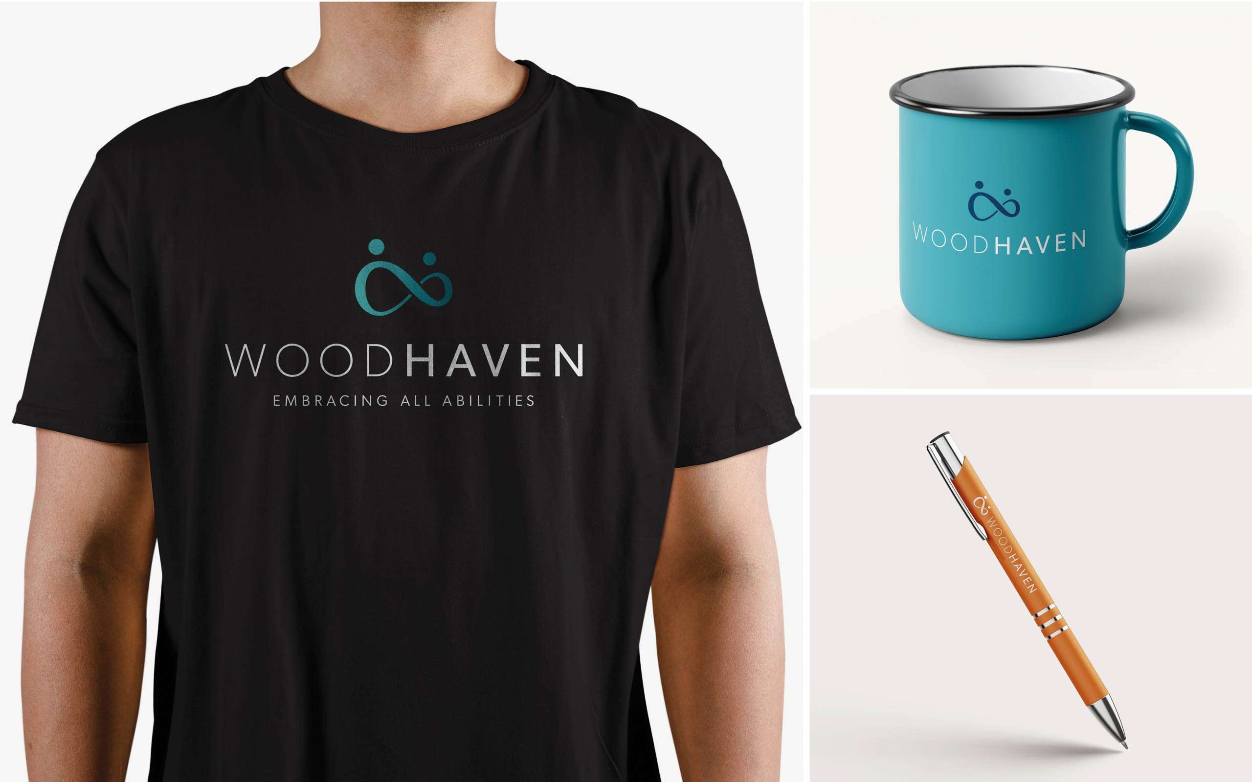
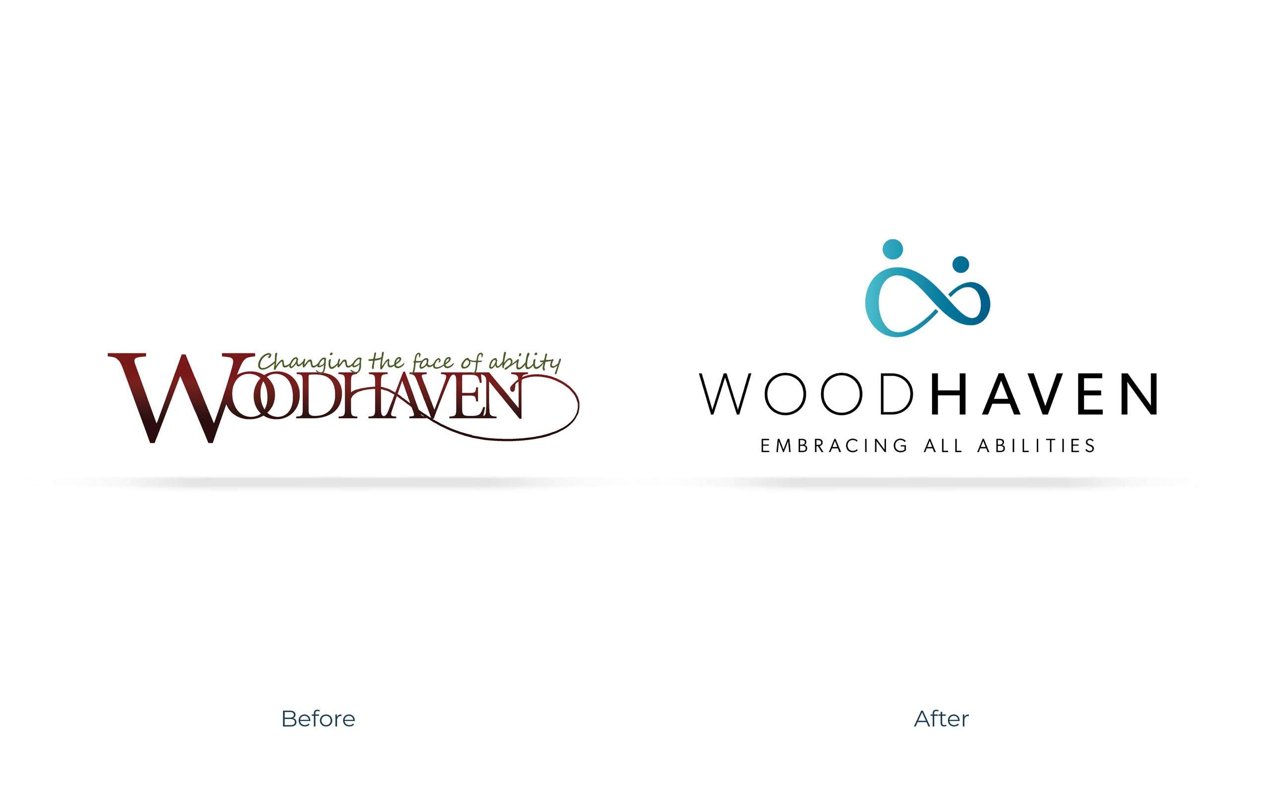
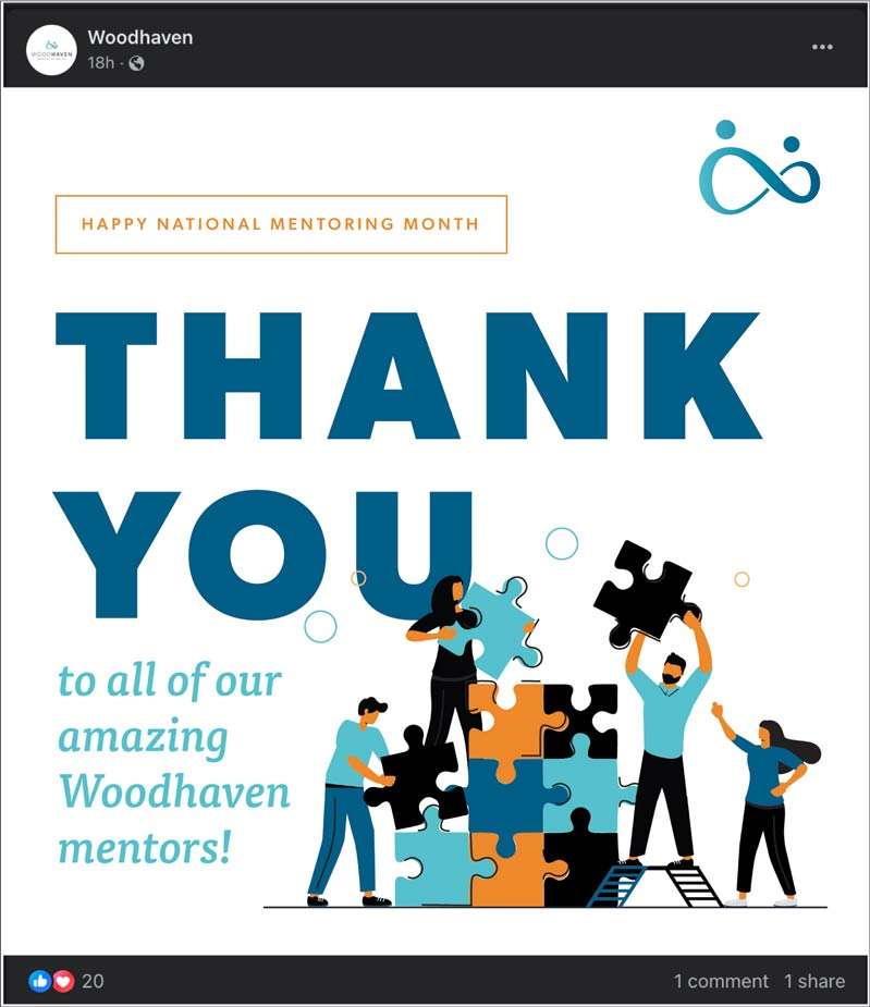
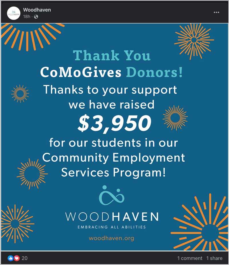
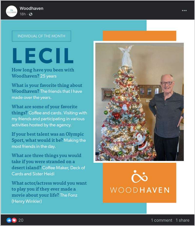
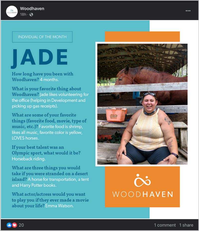
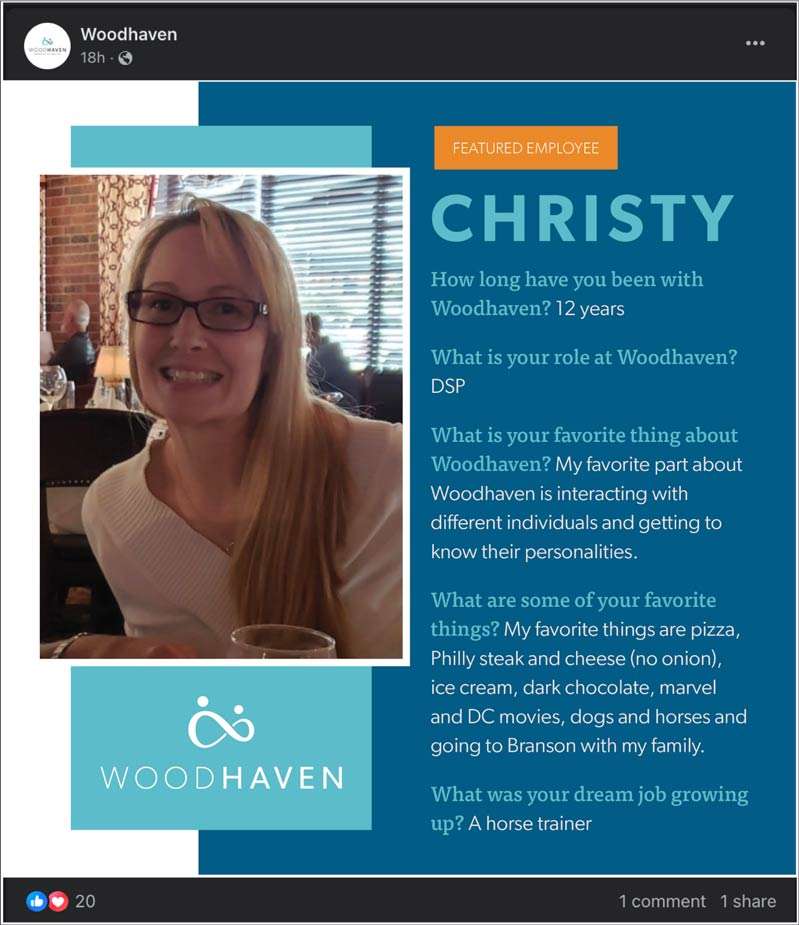
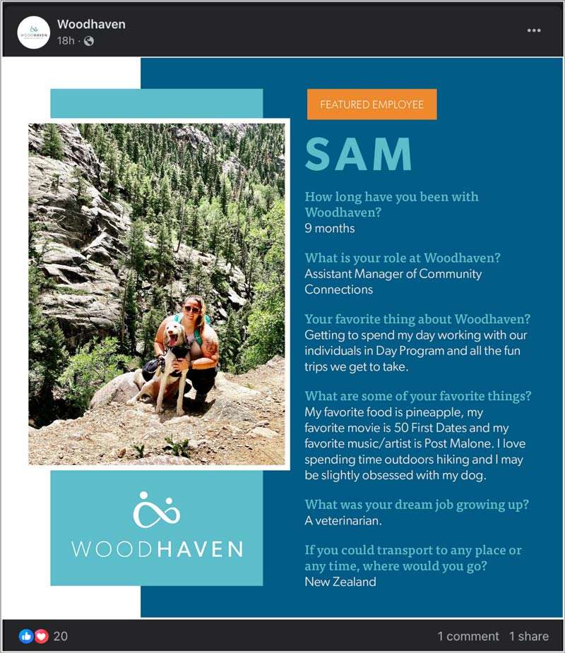
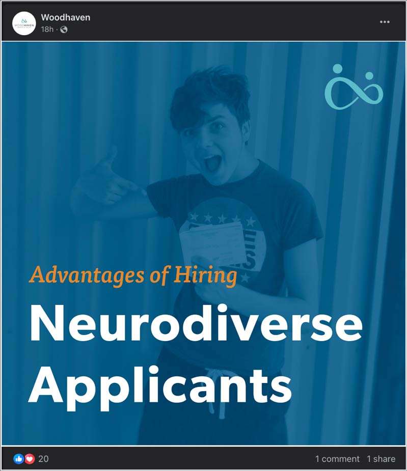
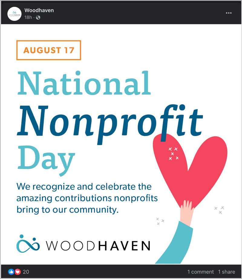
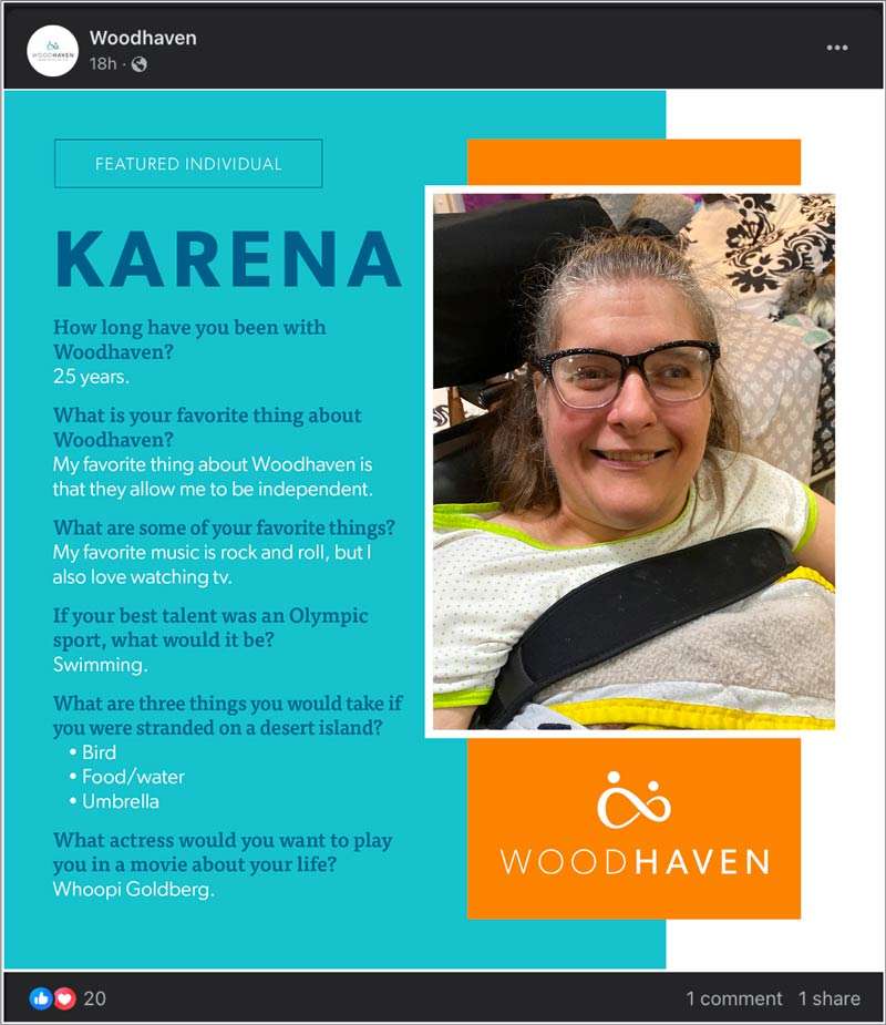
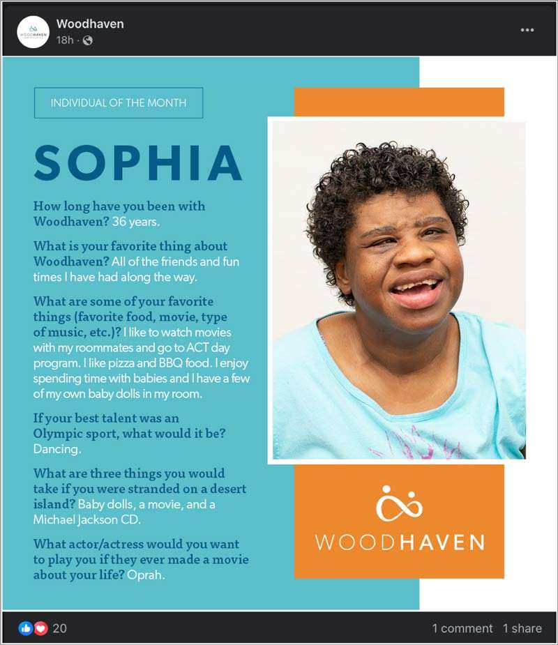
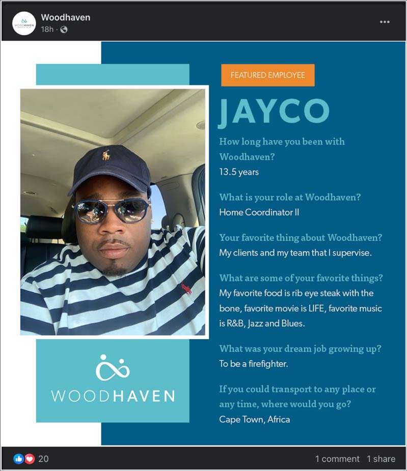
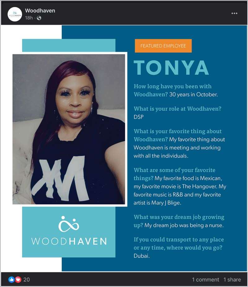
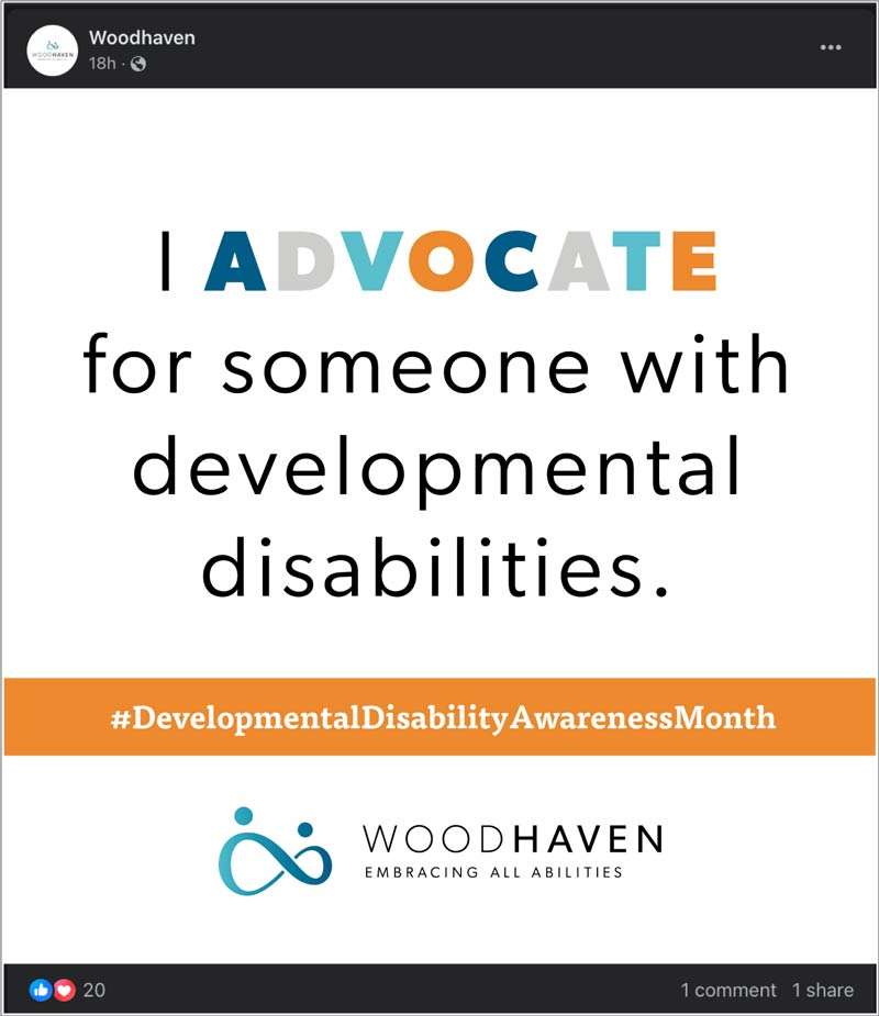
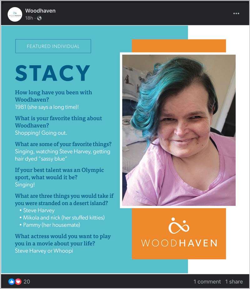
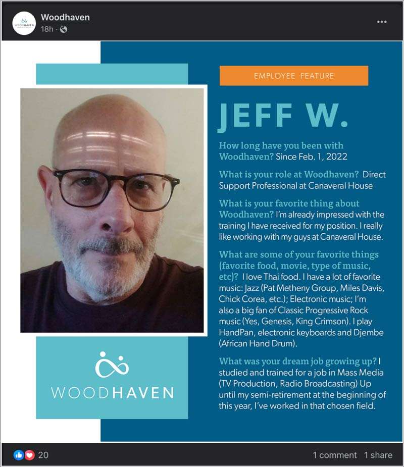
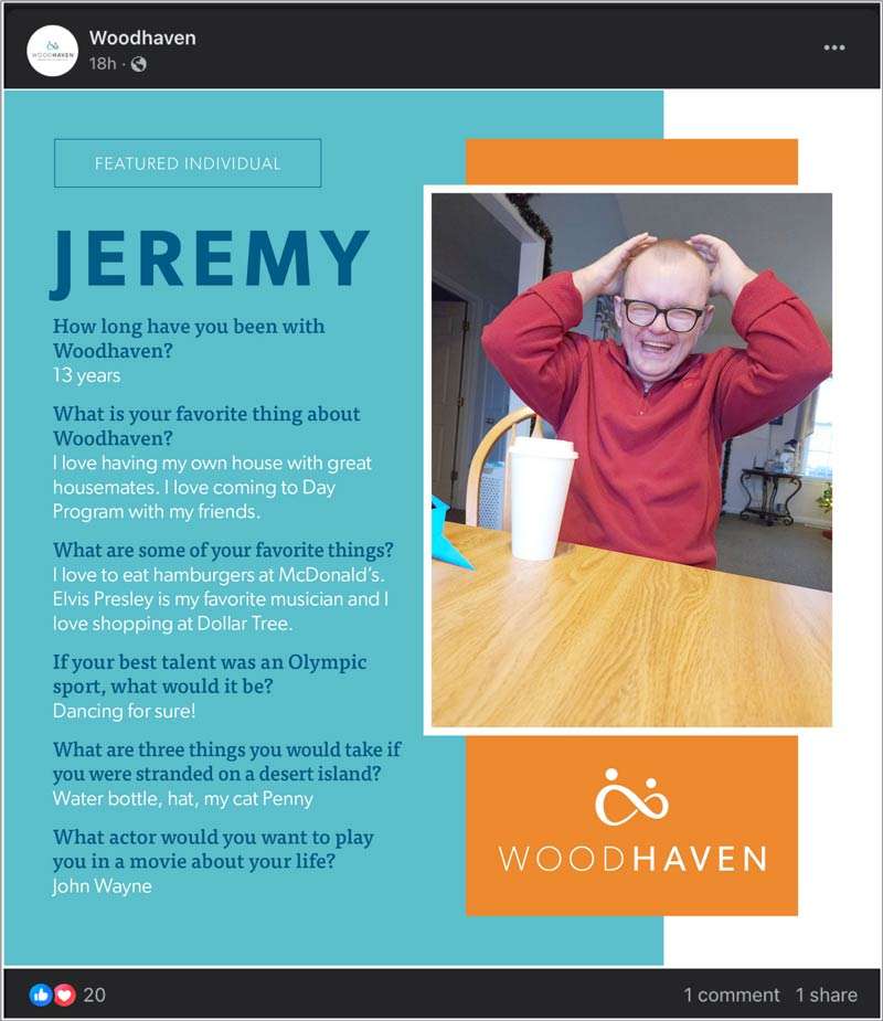
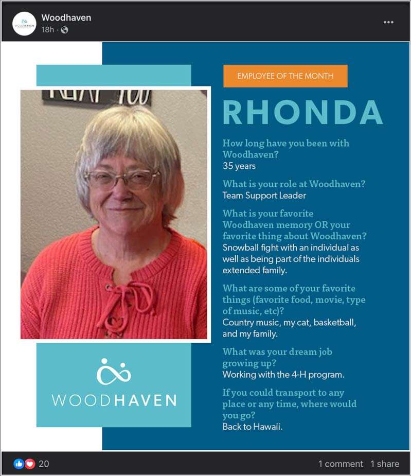
We collaborated with Woodhaven to execute a comprehensive rebrand, delivering a new website, organic social media, email campaigns, blogs, and high-quality graphic design work. Through our joint efforts with the Woodhaven team, they now enjoy a cohesive and vibrant brand image that effectively communicates their values and vision.
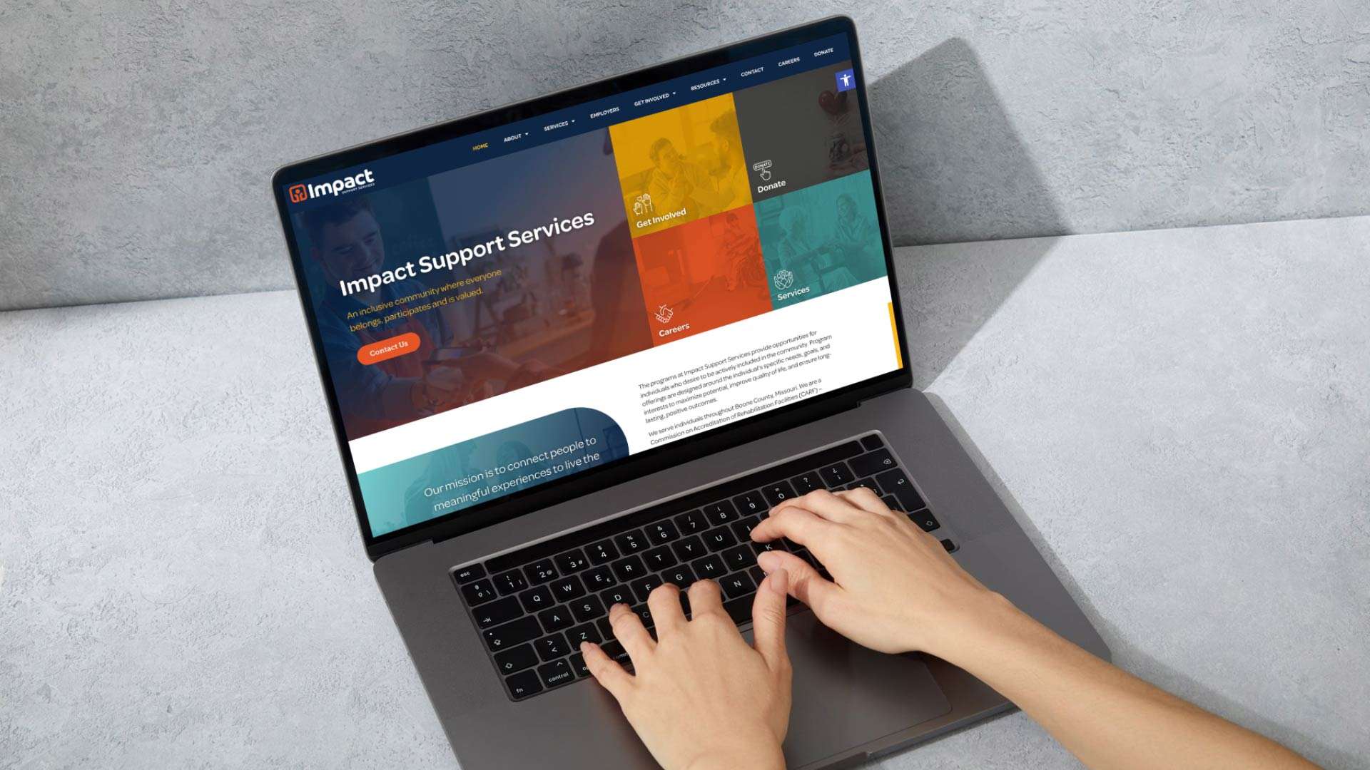
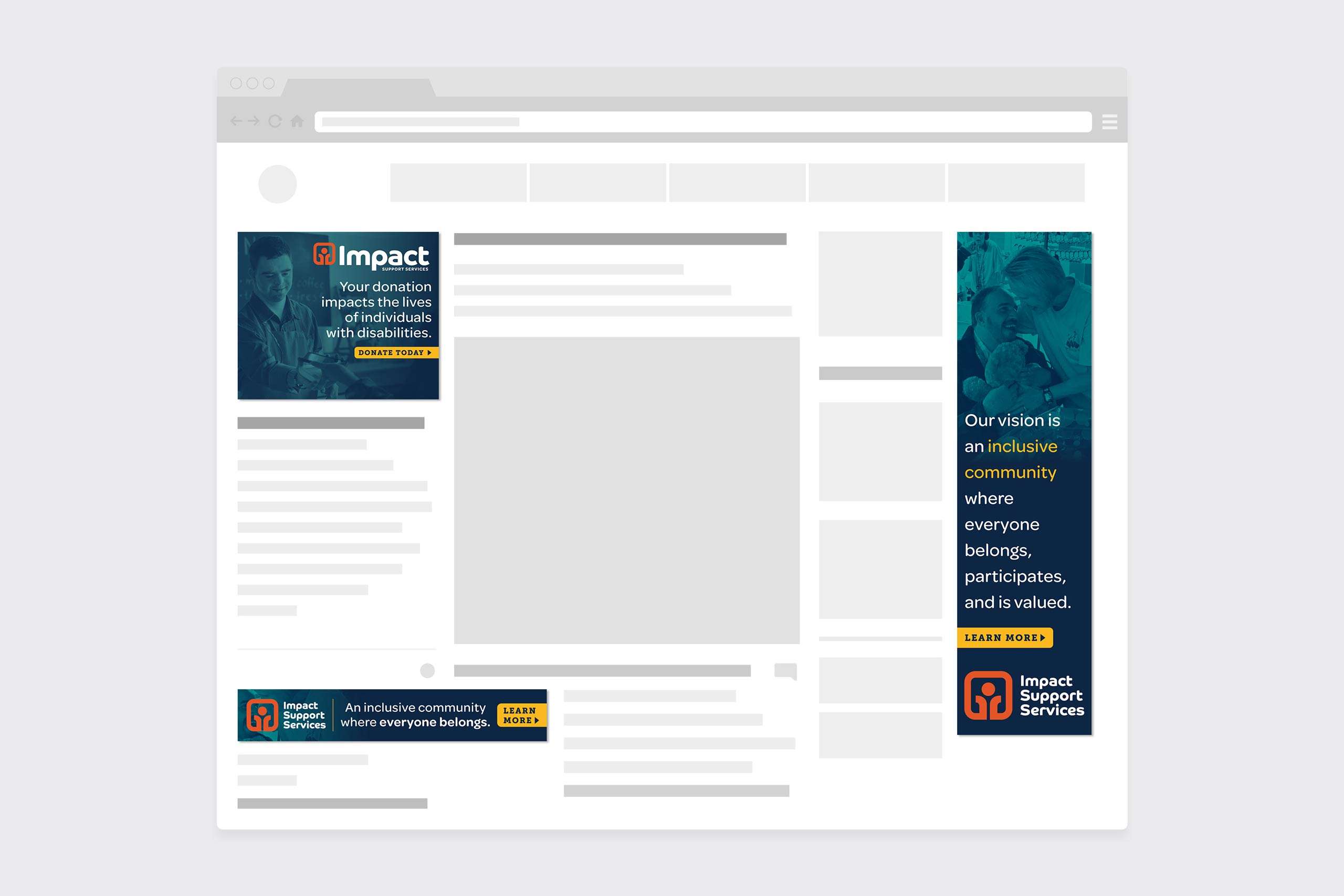
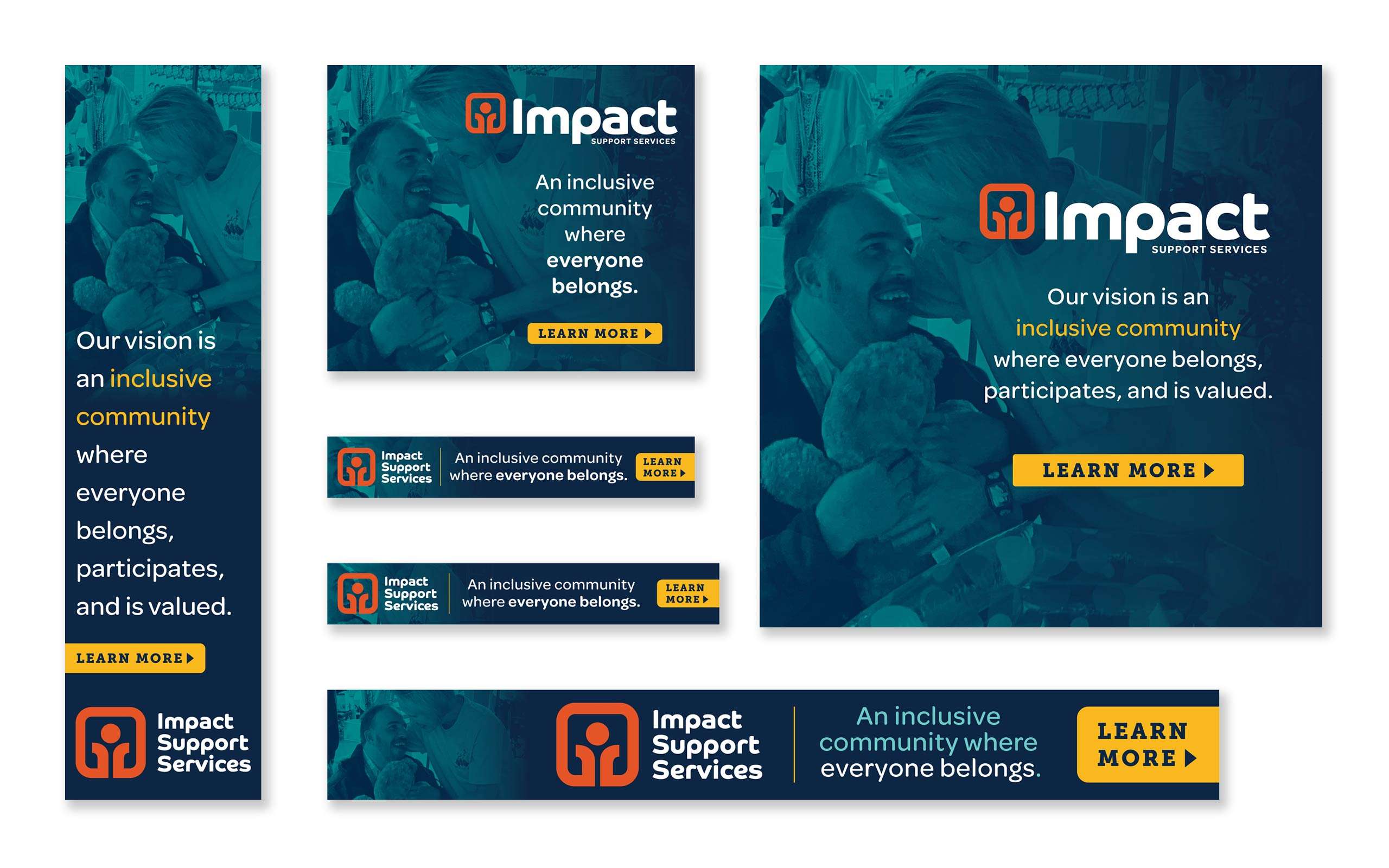
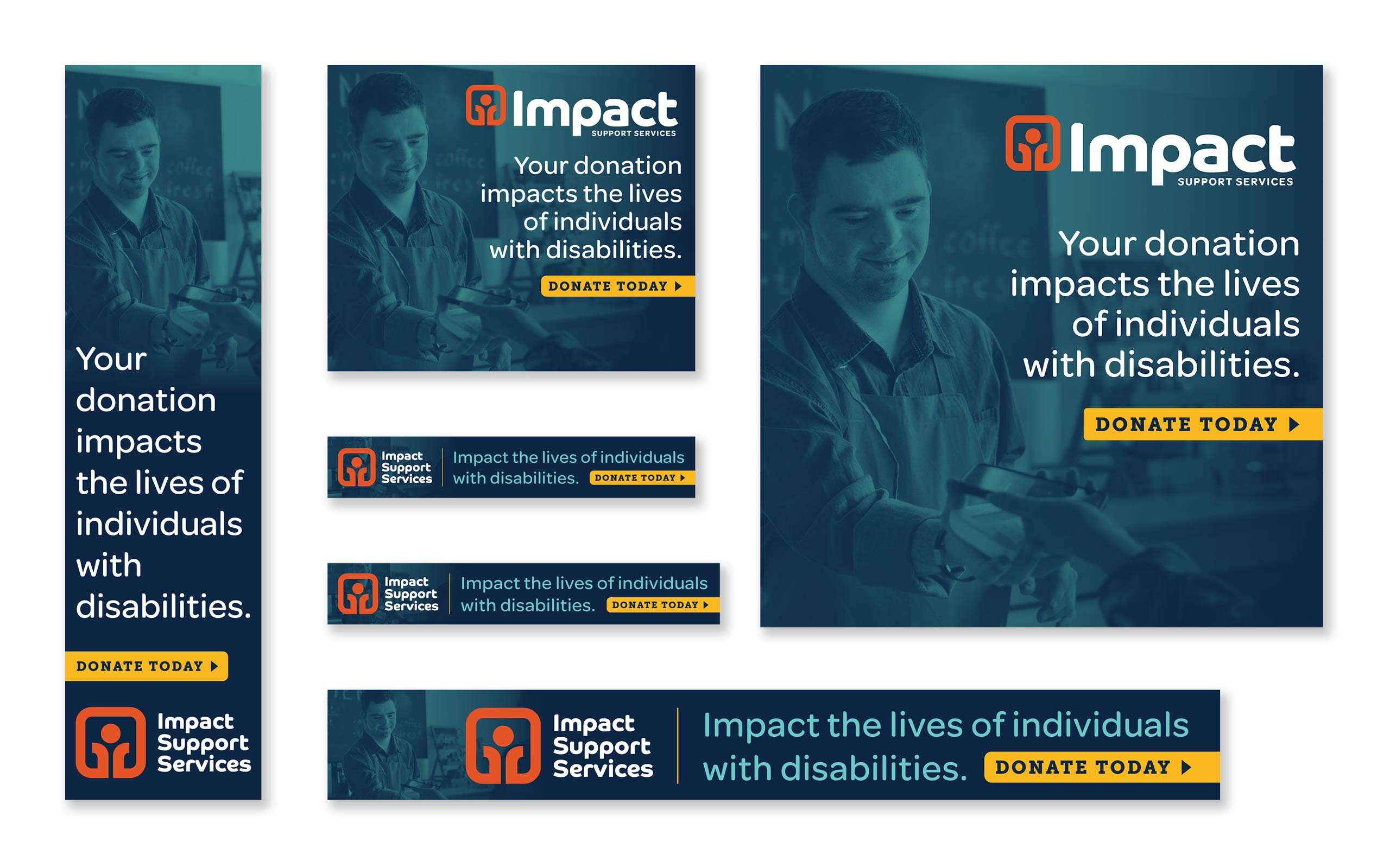
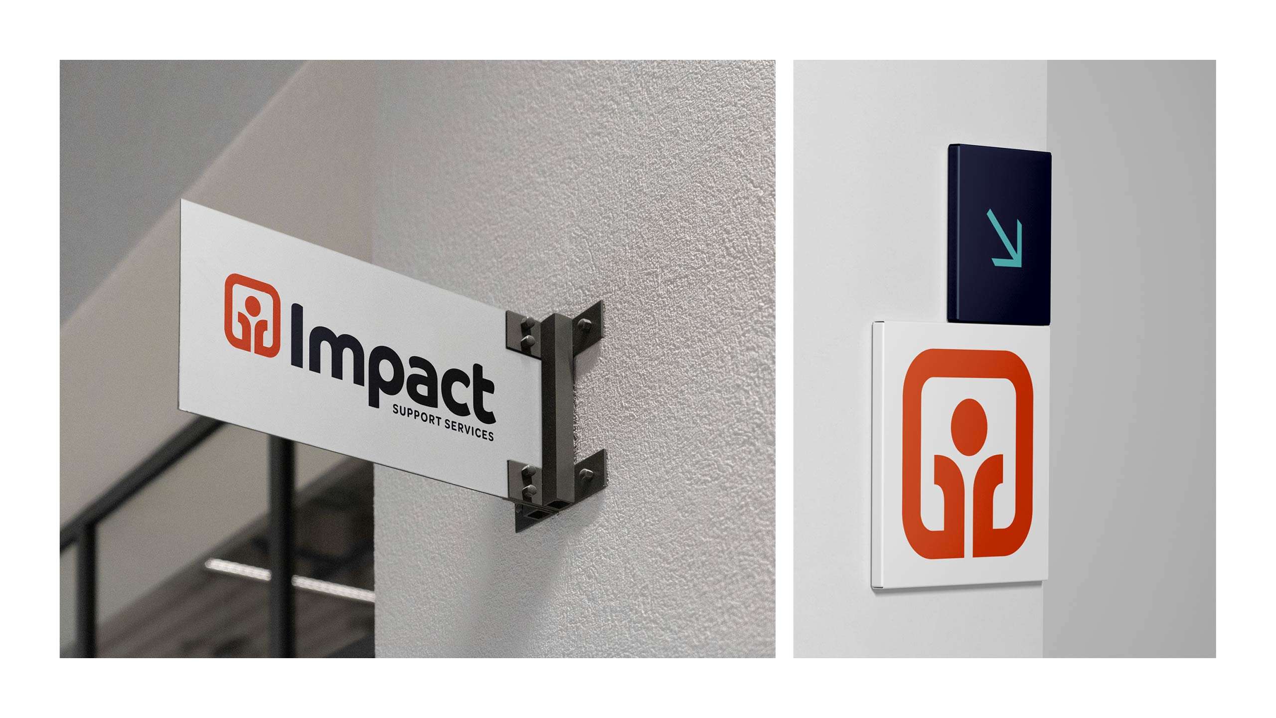
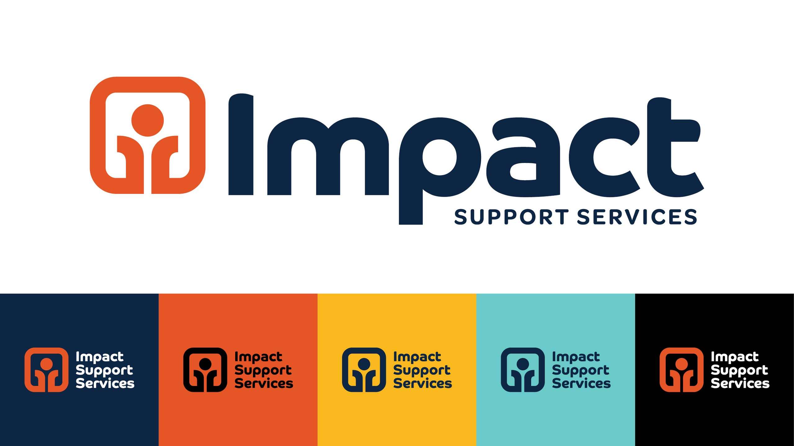
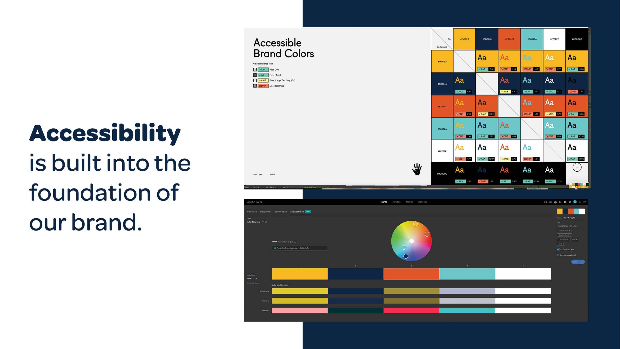
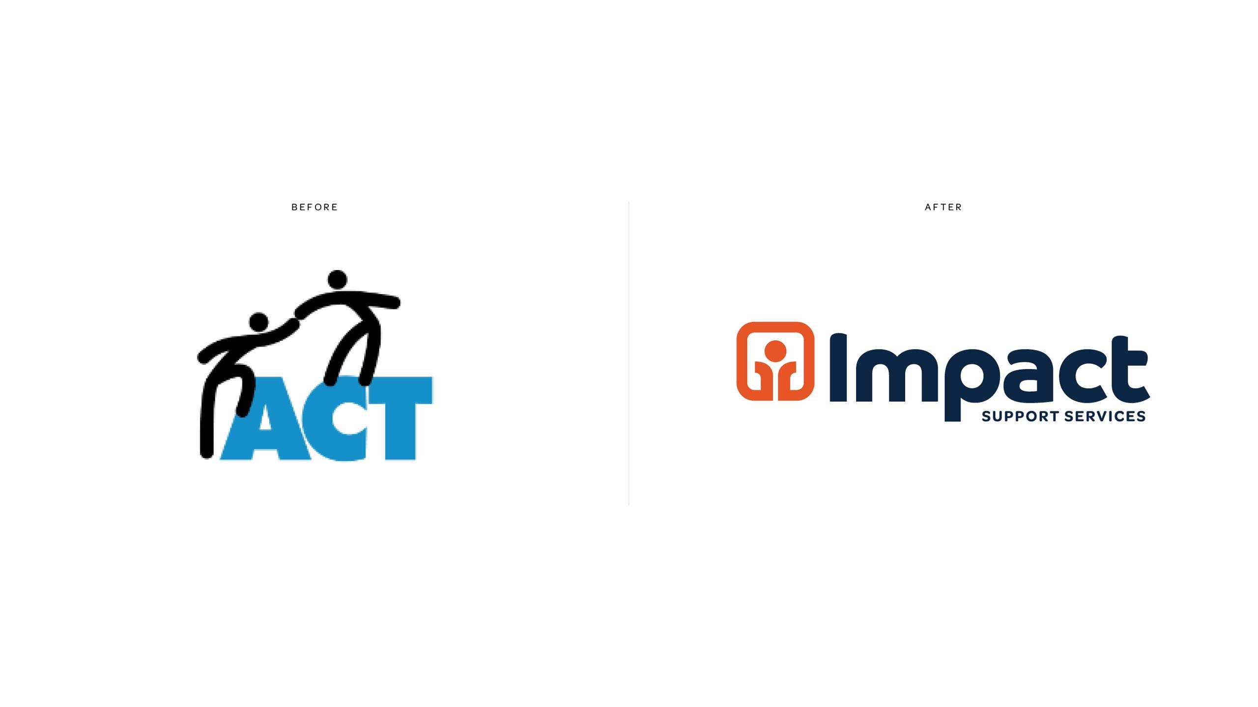
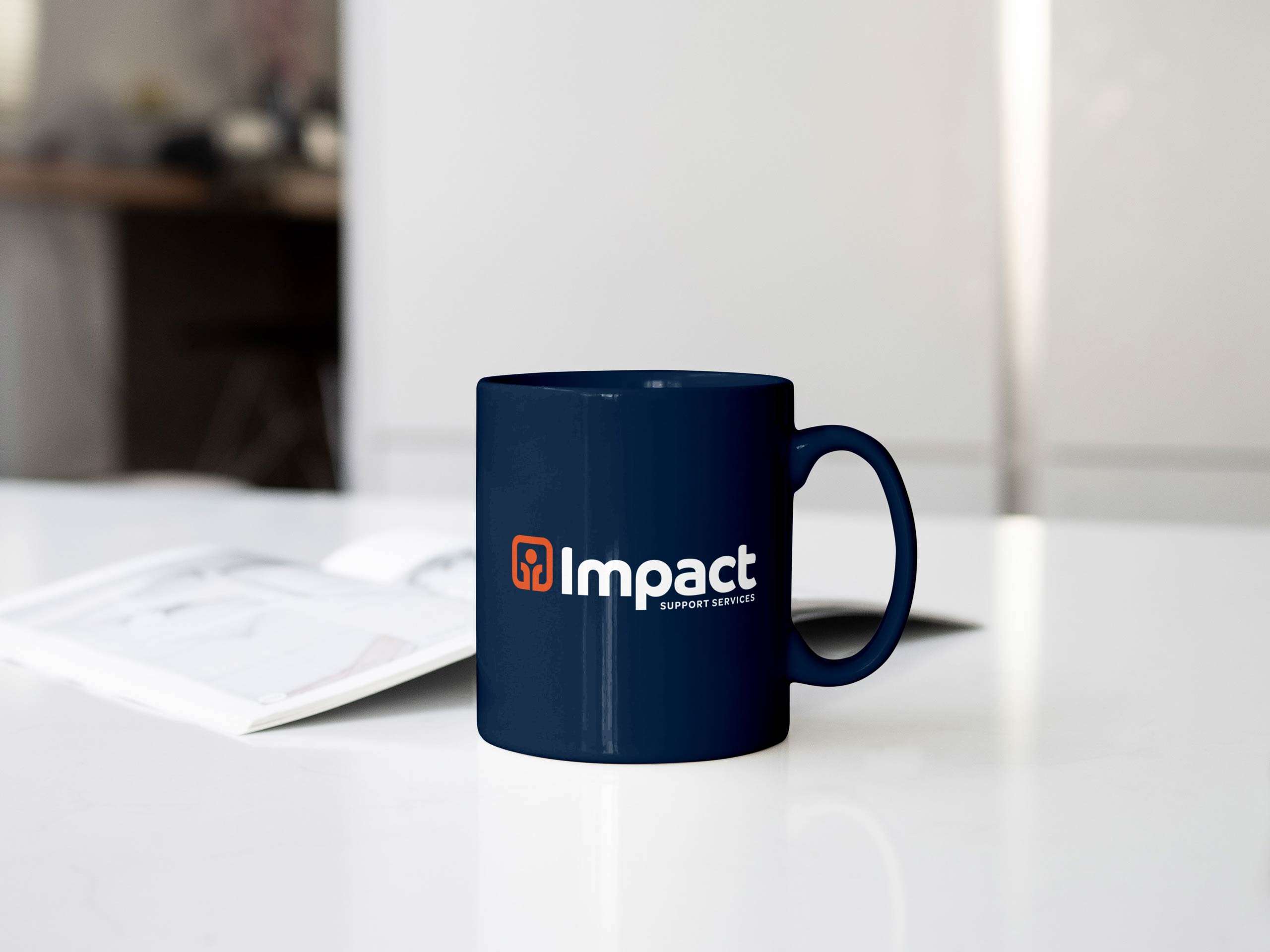
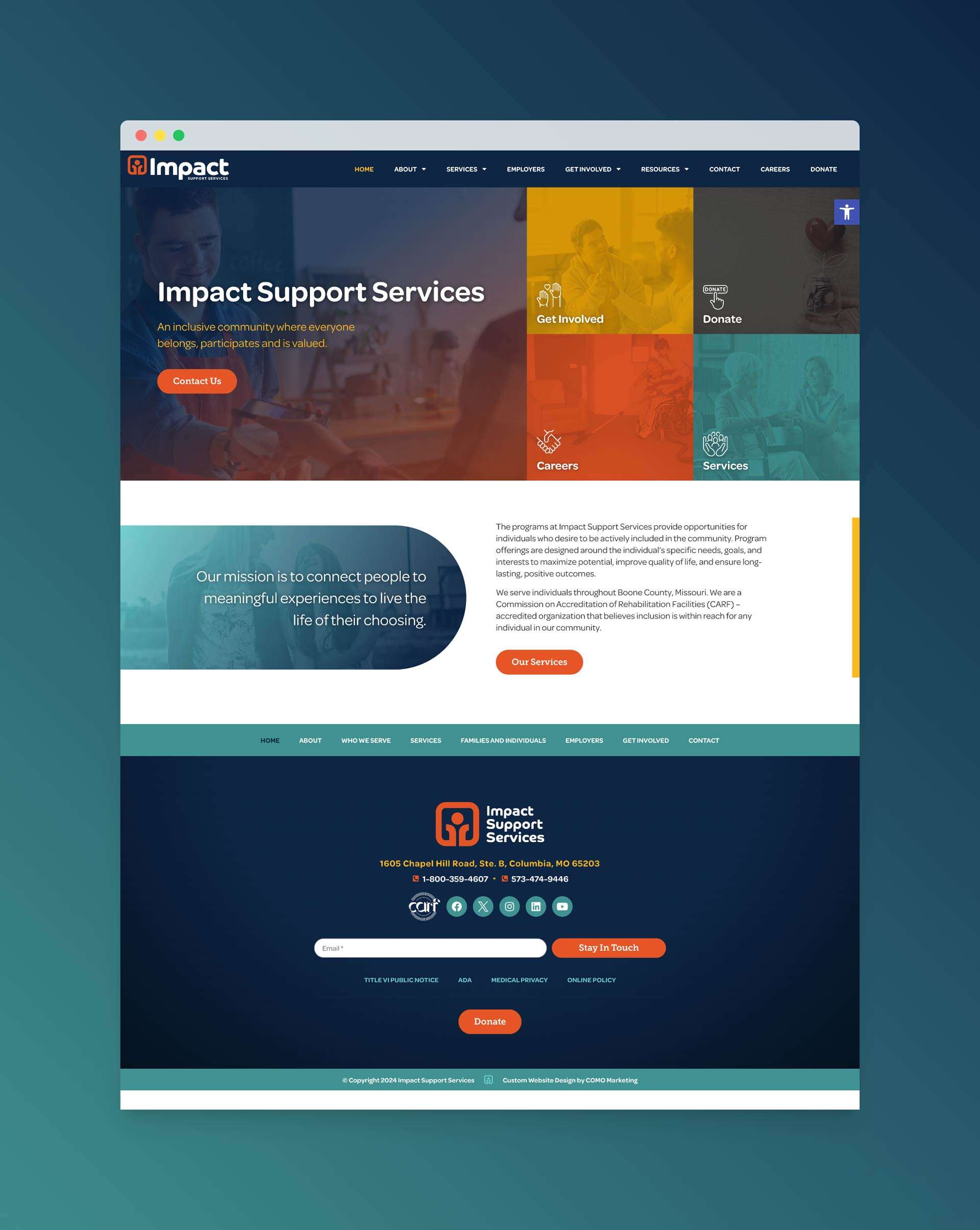
COMO Marketing collaborated with Impact Support Services to transform their brand identity, starting with a name change from ACT to Impact Support Services. Our comprehensive rebranding efforts included designing a new website and creating targeted digital ads. The new brand identity and online presence effectively reflect their mission and values, enhancing their ability to connect with and support their community. This collaboration has provided Impact Support Services with a fresh, modern look that resonates with their audience and strengthens their impact.
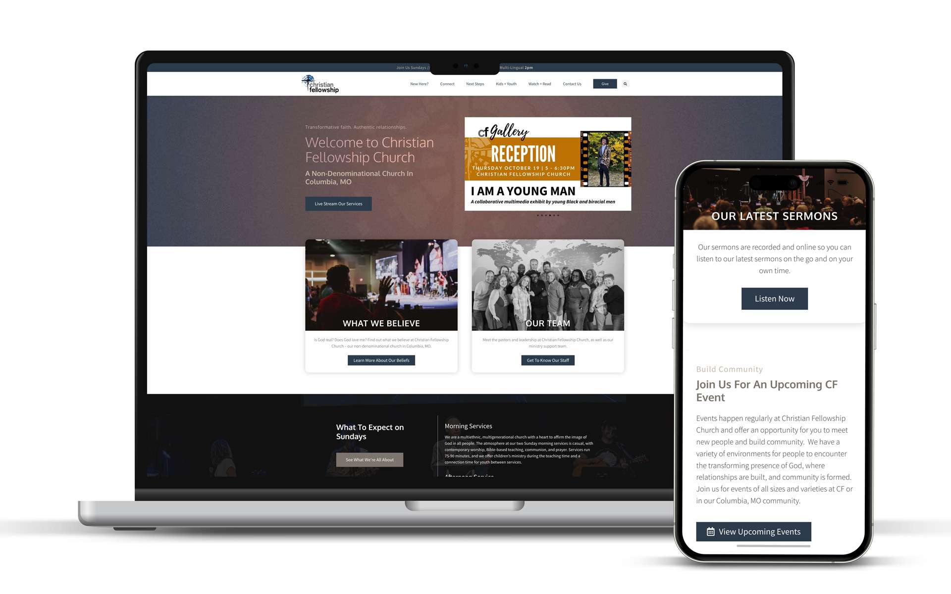
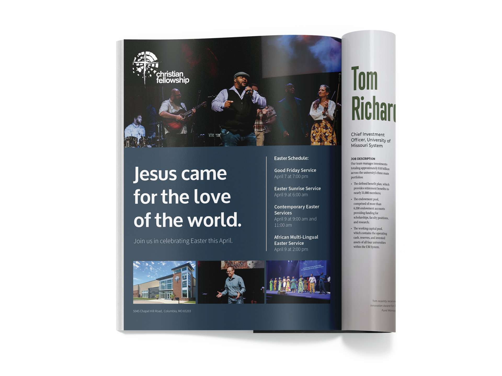
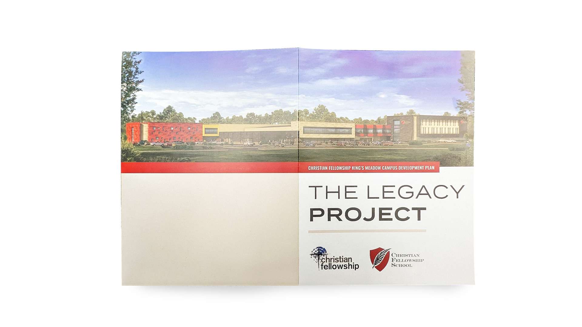
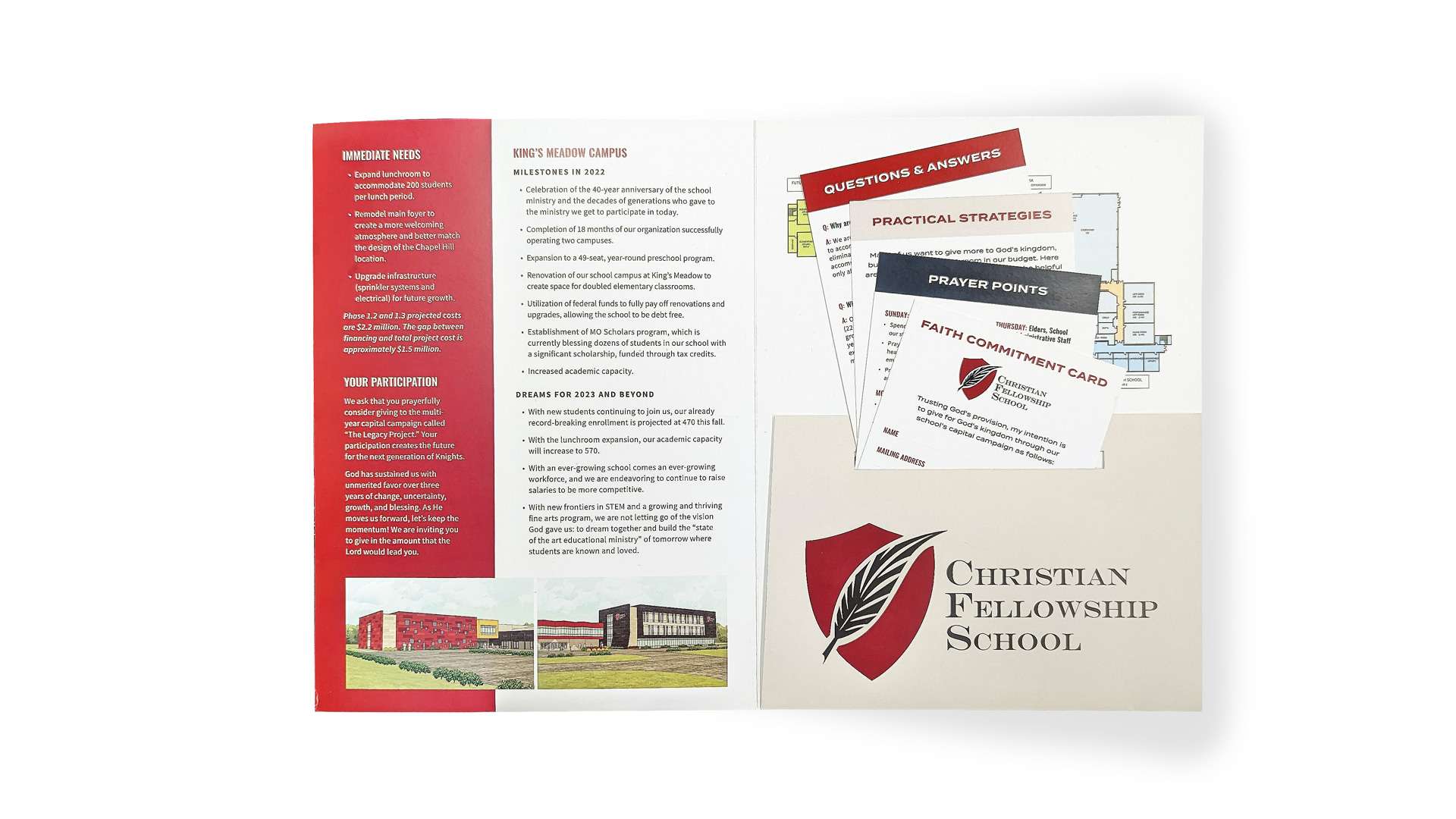
We partnered with Christian Fellowship Church to elevate their online presence through a comprehensive website redesign, targeted Google Ads, and Search Engine Optimization (SEO). Additionally, we provided high-quality graphic design work for their capital campaign. Our efforts have made it easier for the church to connect with their community, attract new members, and communicate their message more effectively. The result is a modern, user-friendly website and an improved digital strategy that supports their mission and outreach.
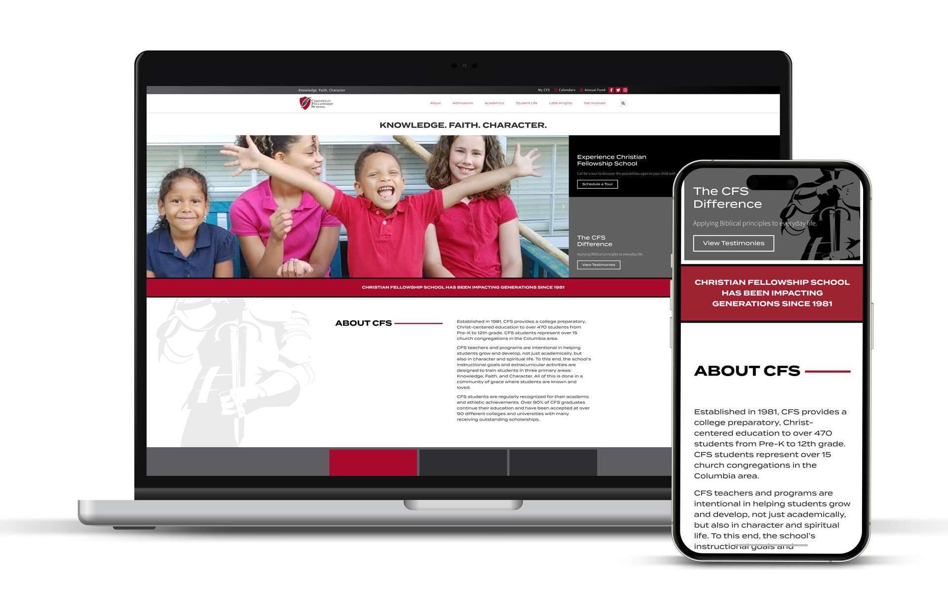
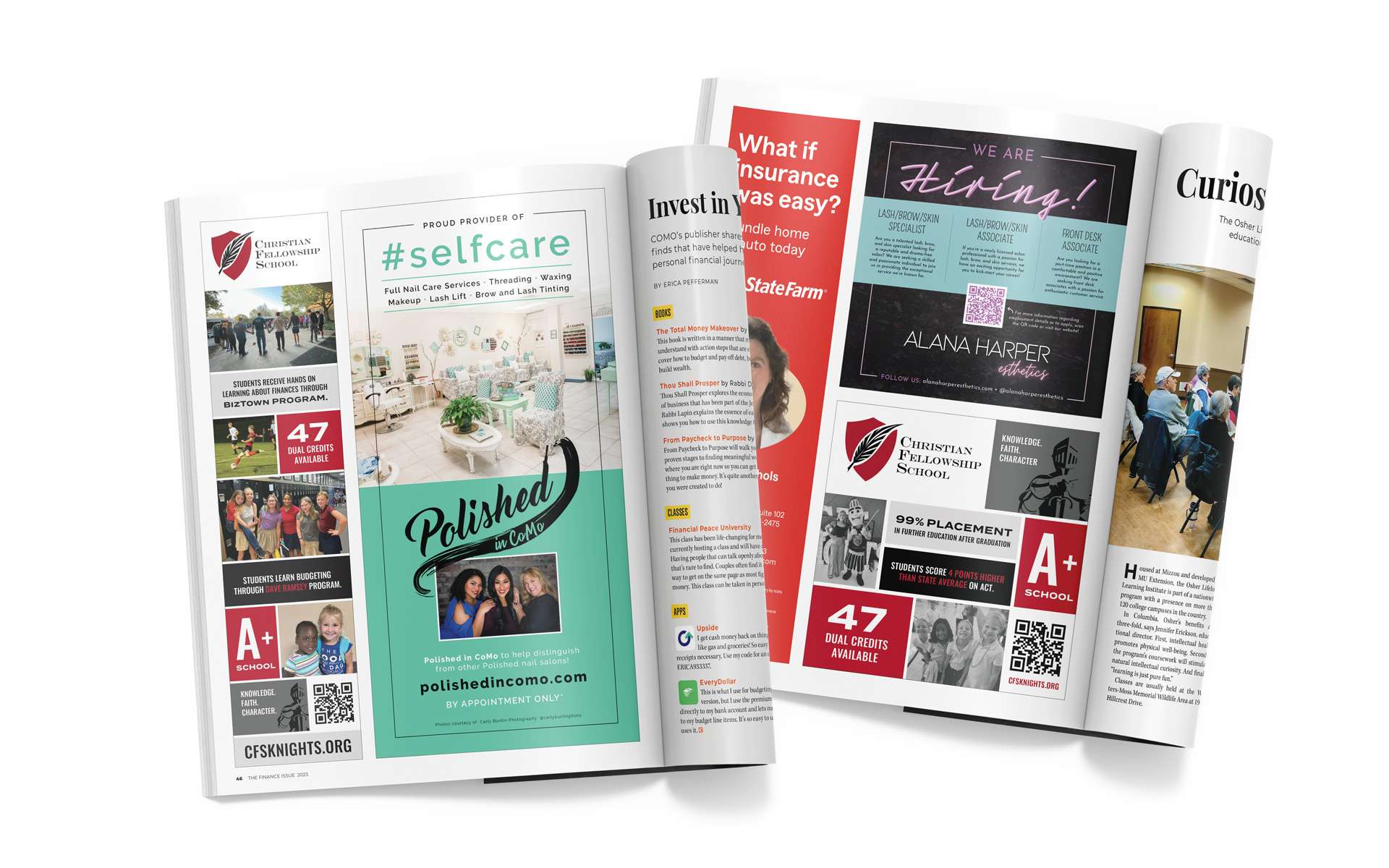
We also partnered with Christian Fellowship School to enhance their marketing and communication efforts through a comprehensive website redesign, magazine ads, sponsored emails, and engaging newsletter ads. This integrated approach has helped the school improve its online presence, attract new students, and communicate with the community. The new digital and print materials help showcase the school’s values and programs, supporting its mission to provide quality education in a nurturing environment.
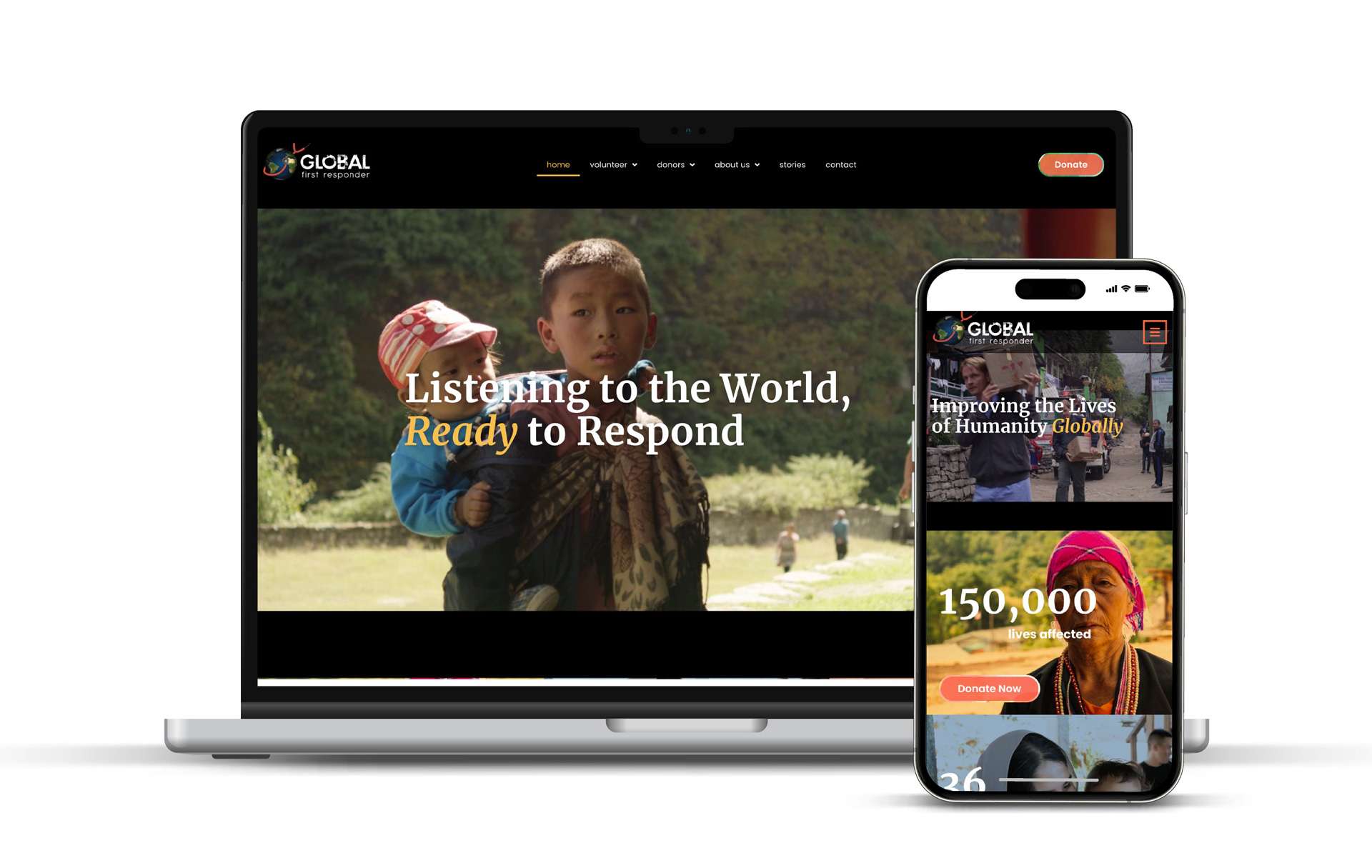
We partnered with Global First Responders to redesign their website, ensuring it effectively communicated their mission and facilitated their global outreach efforts. Collaborating closely with a team frequently traveling around the world, we developed a dynamic and user-friendly site that showcases their impactful work. To support their need for flexibility, we made the site easy to edit, allowing their team to quickly update content and share real-time information from anywhere in the world.
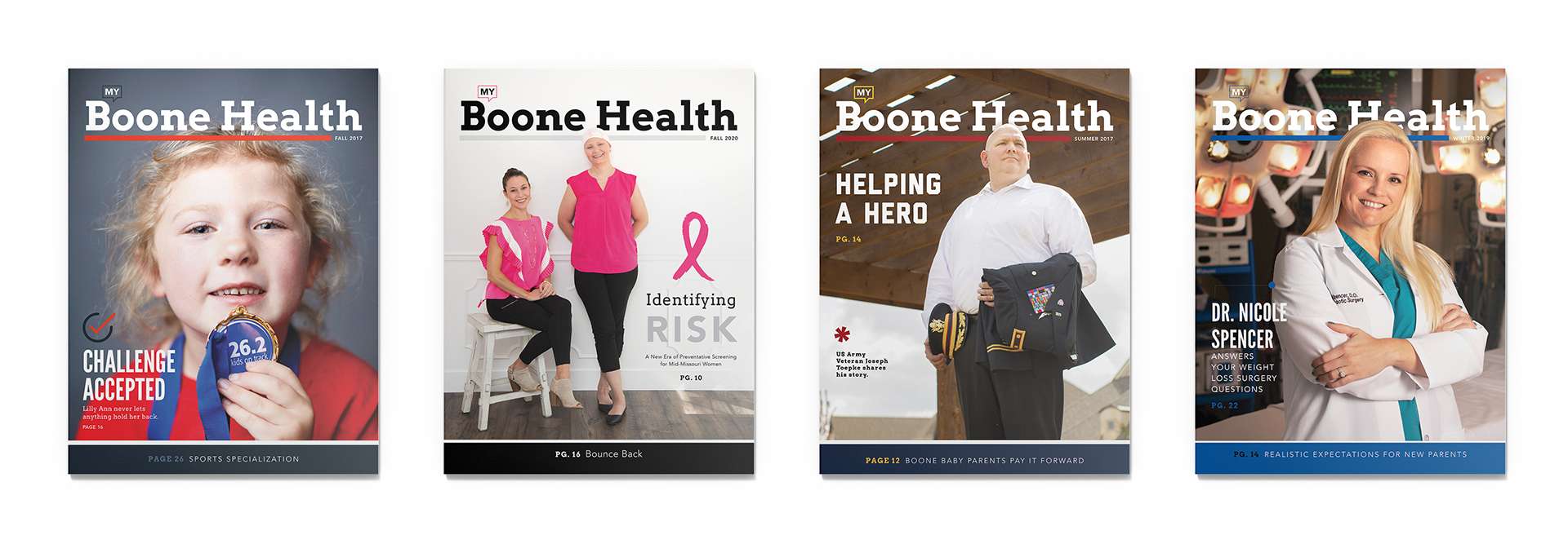
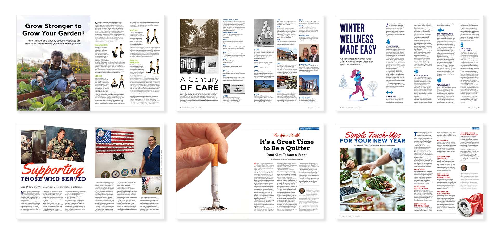
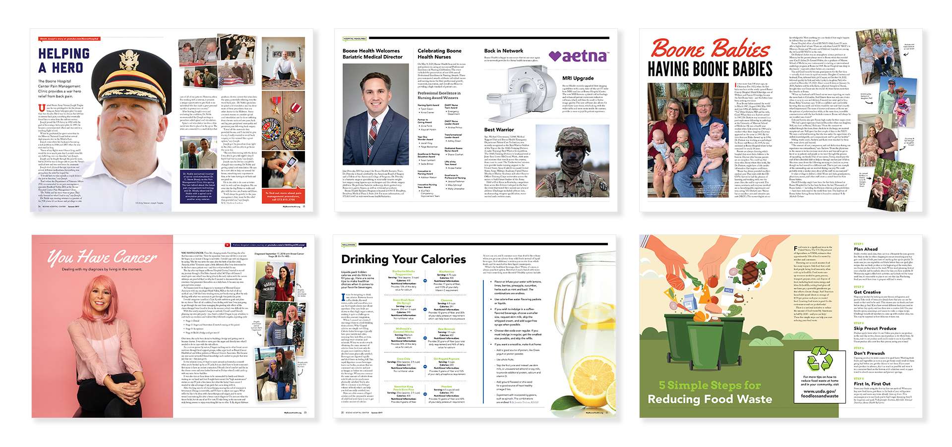
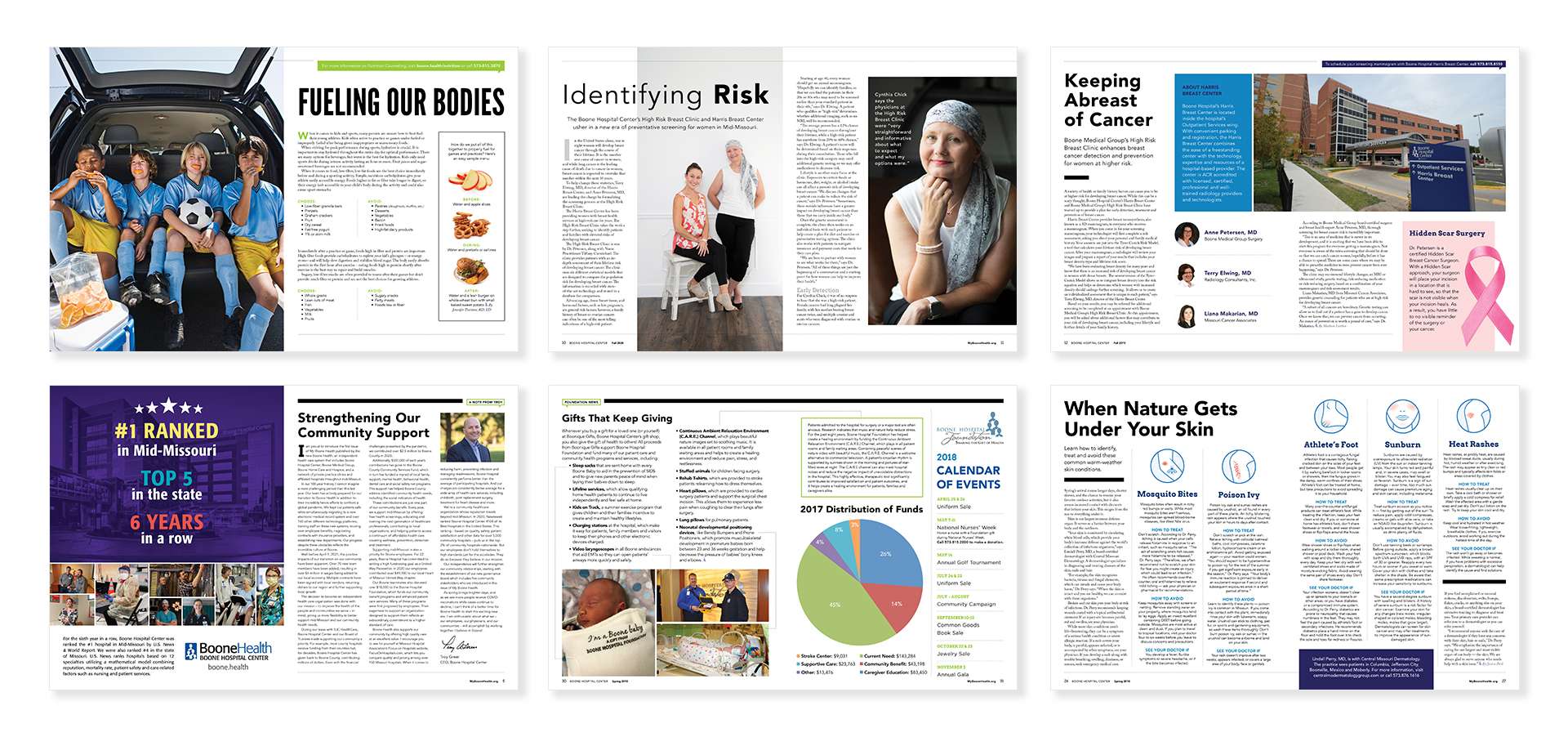
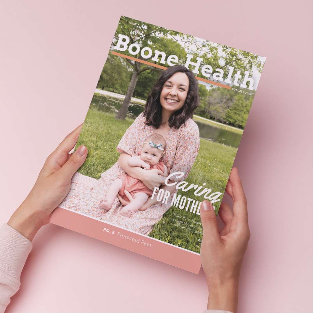
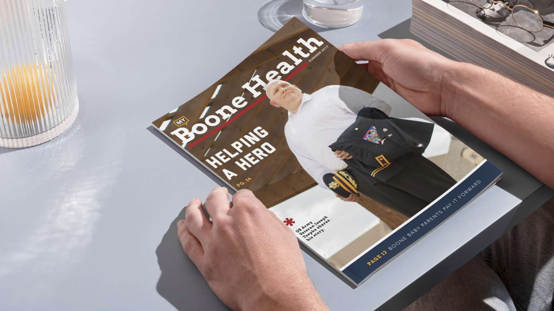
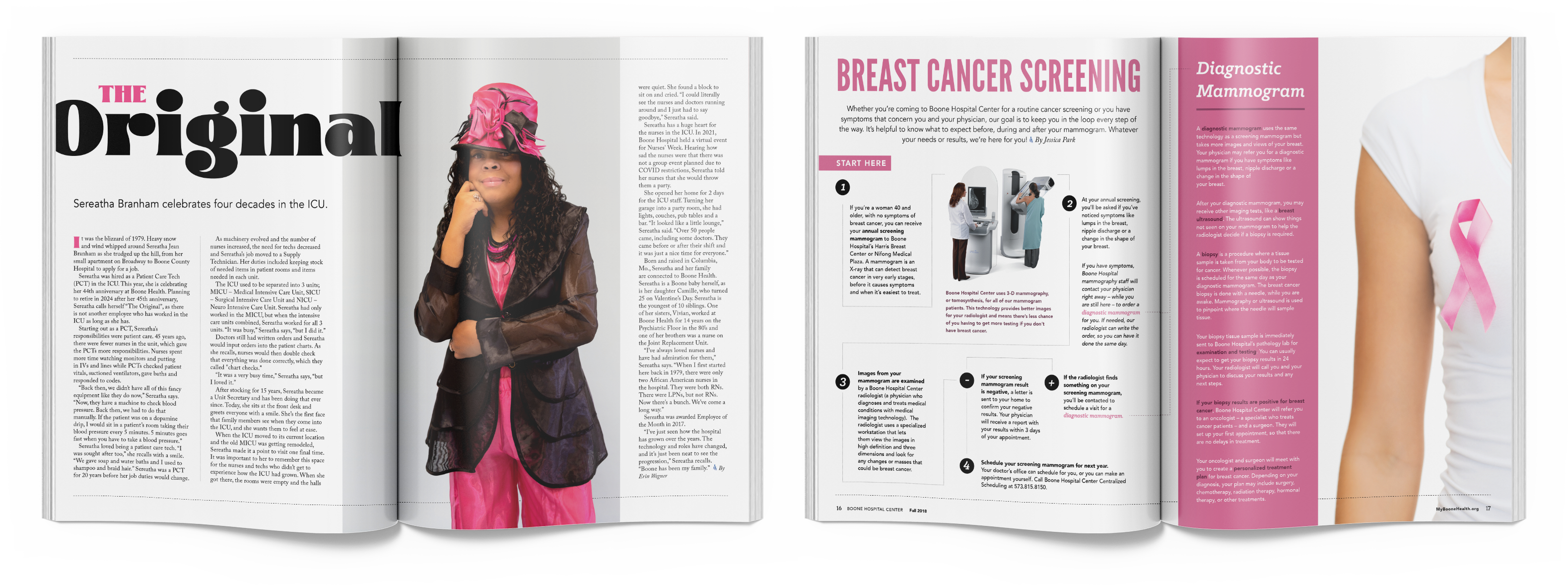
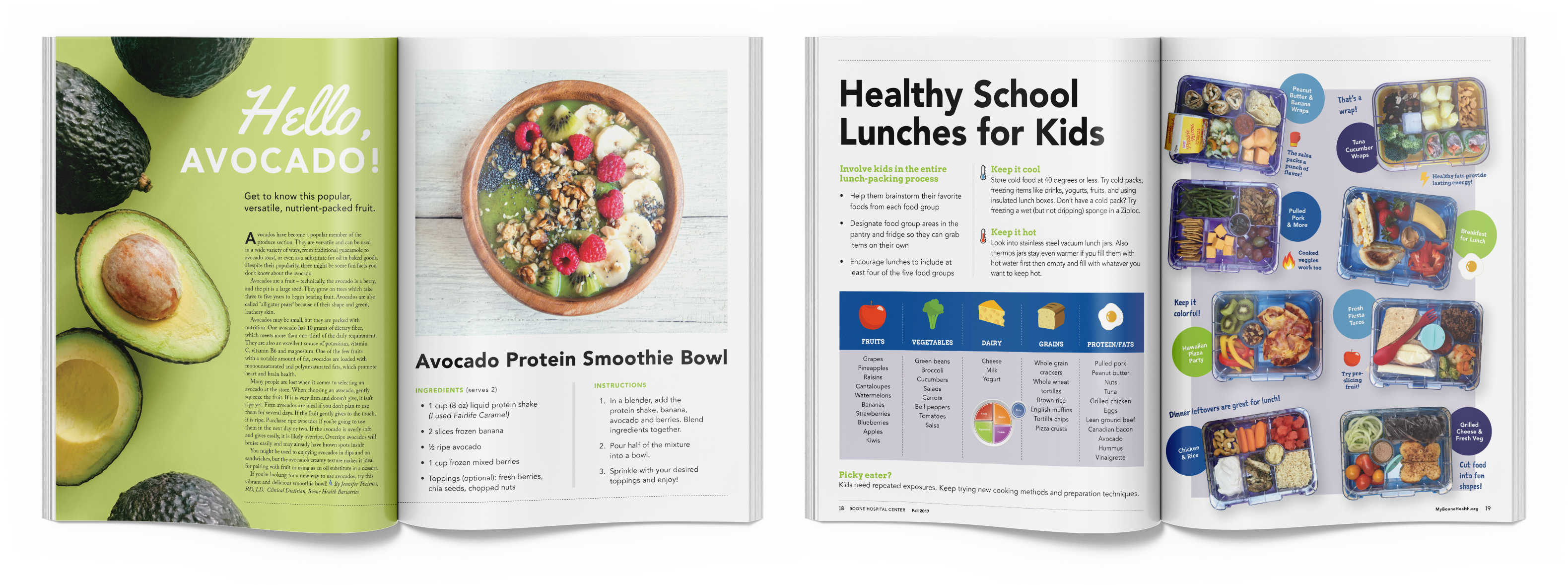
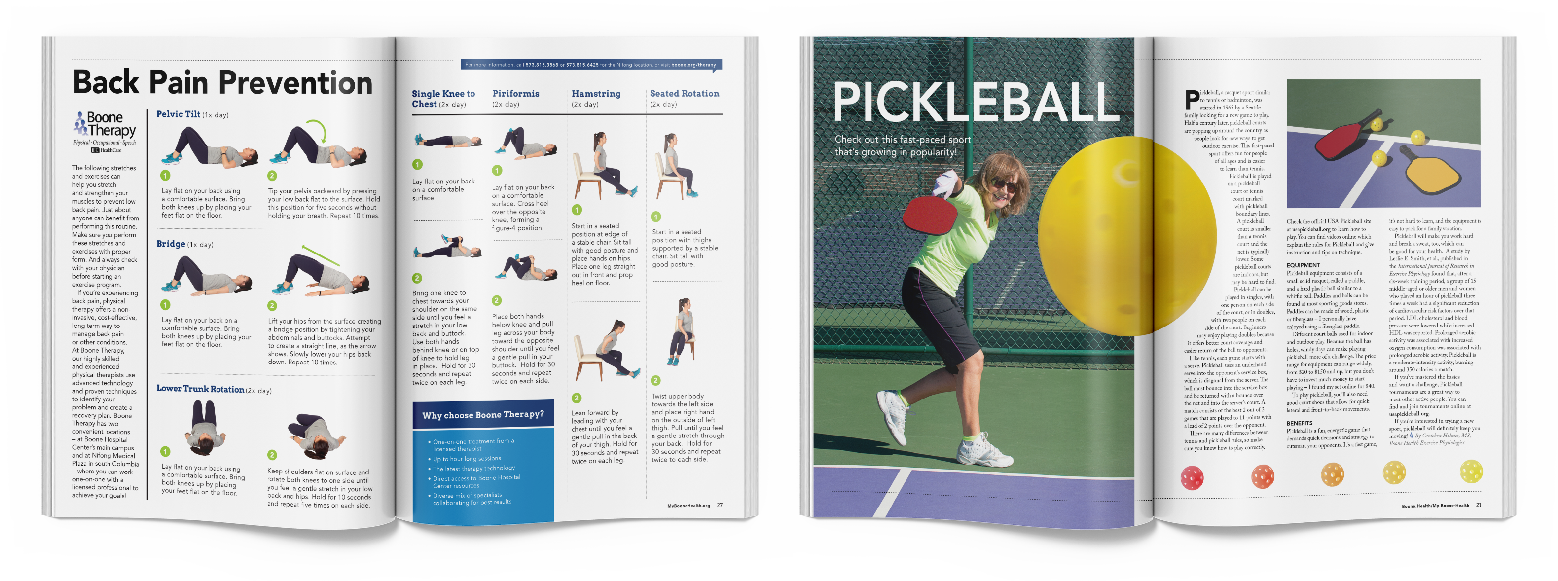
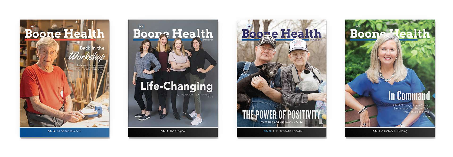
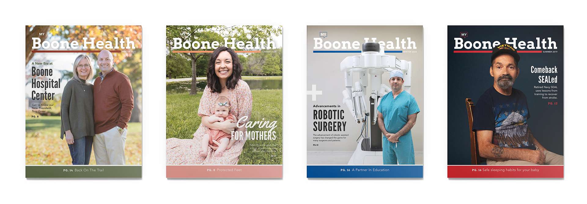
Since 2017, we have partnered with Boone Hospital to produce their quarterly custom publication, “My Boone Health.” This ongoing project involves photographing and compiling engaging content that highlights the hospital’s services, patient stories, health tips, and more. The consistent dedication of both teams to quality and relevance has helped “My Boone Health” become a trusted resource for patients and the community.
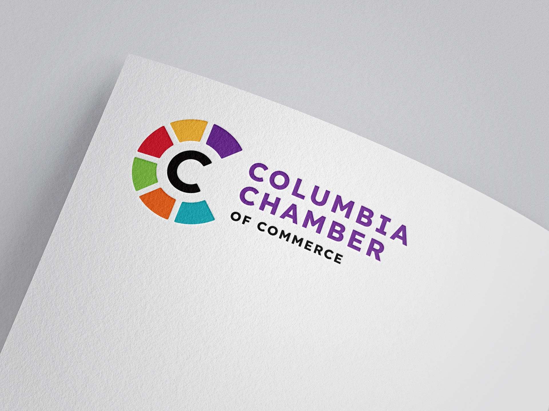
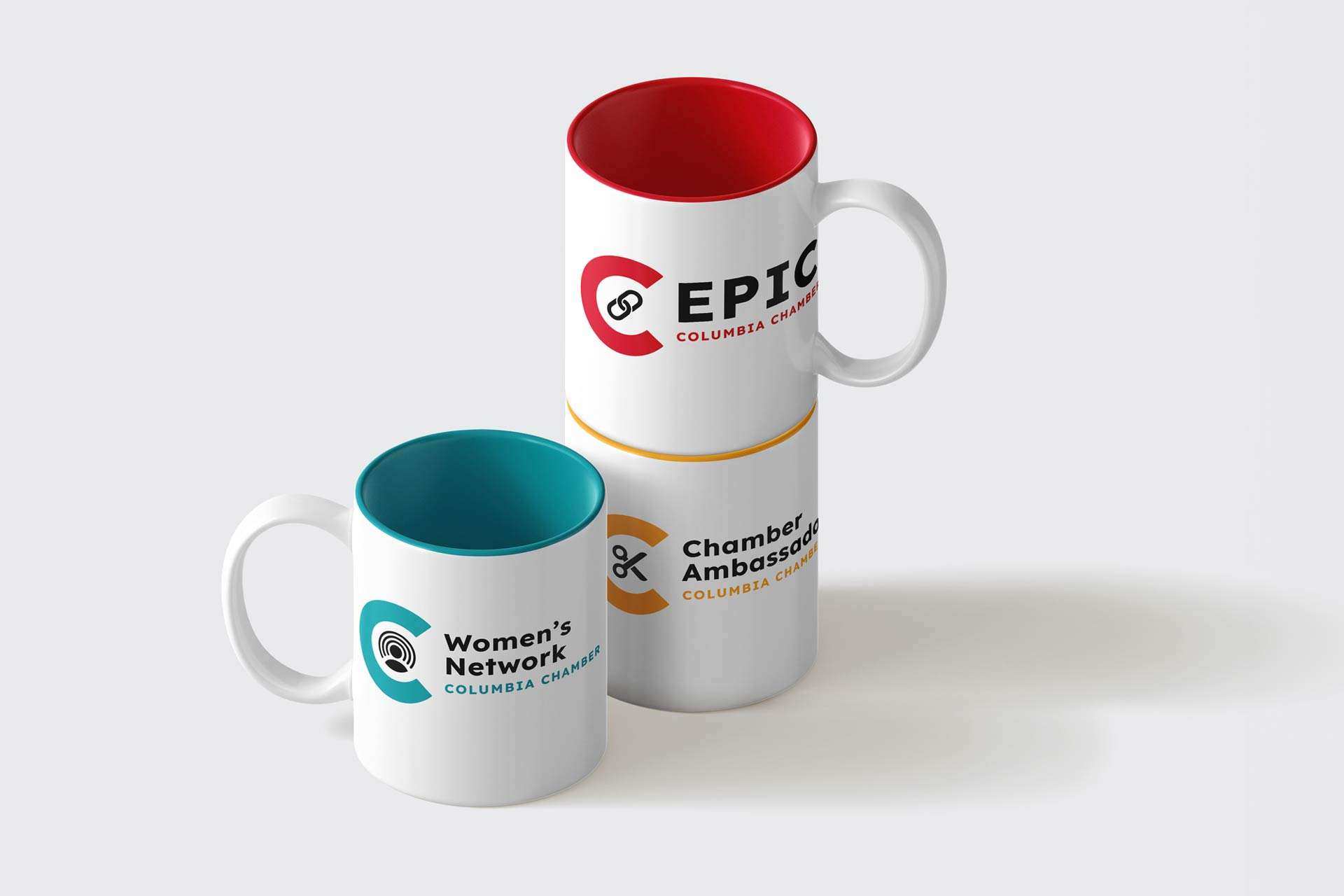
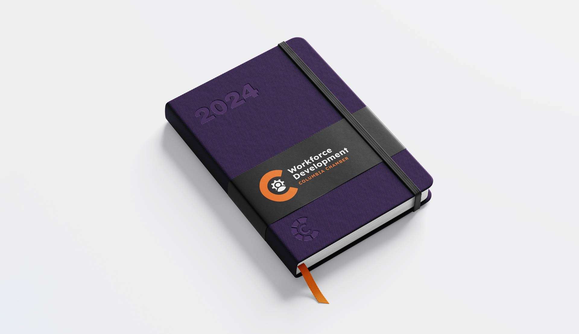
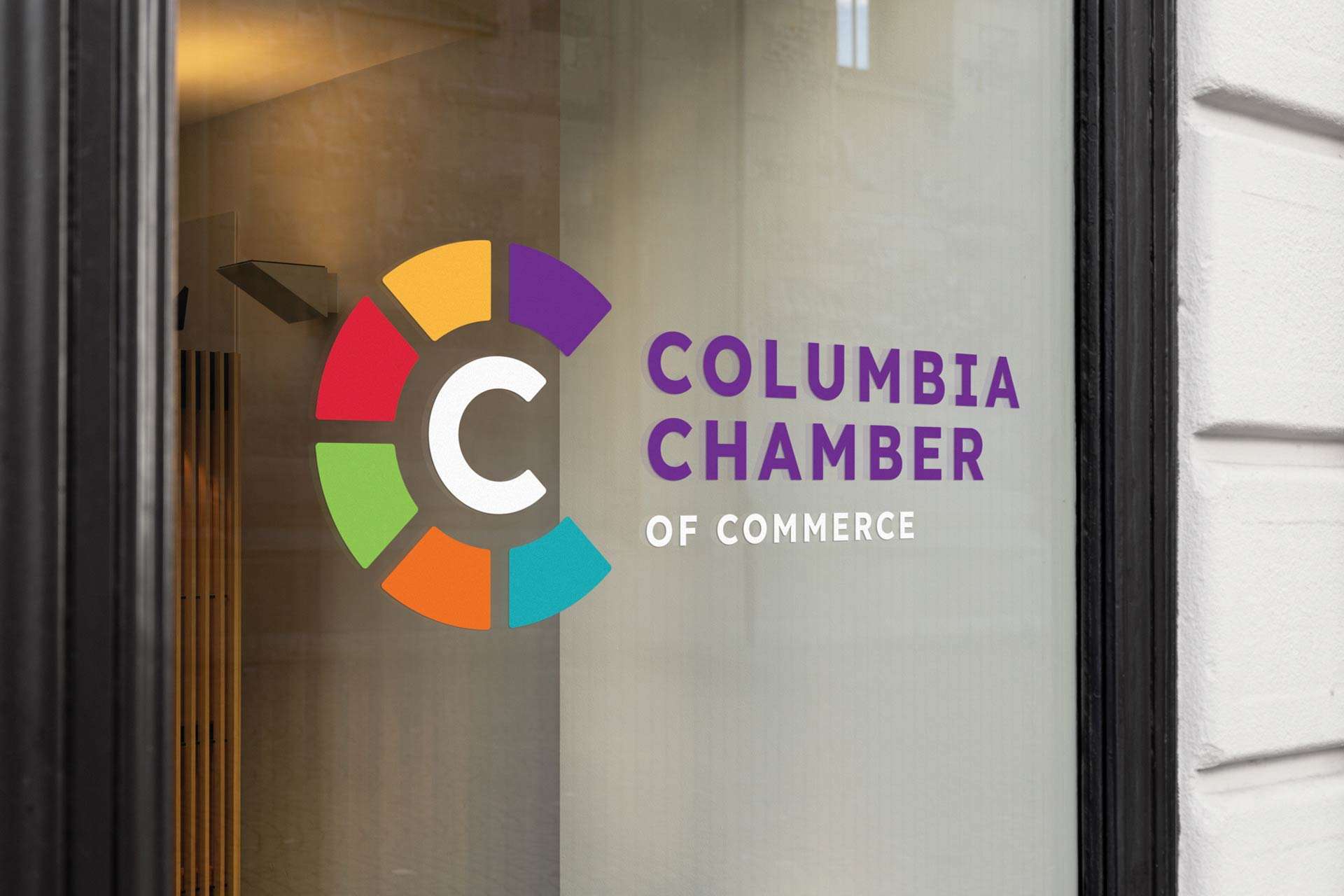
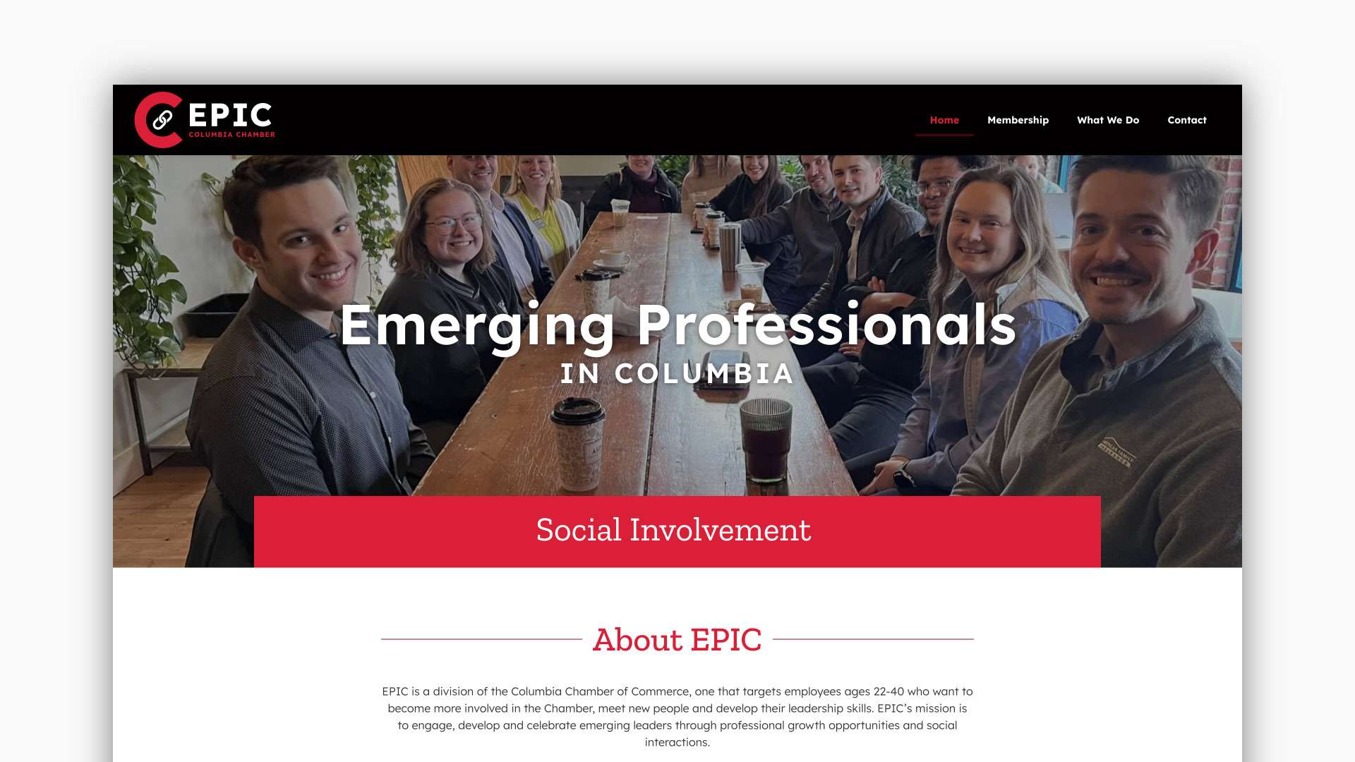
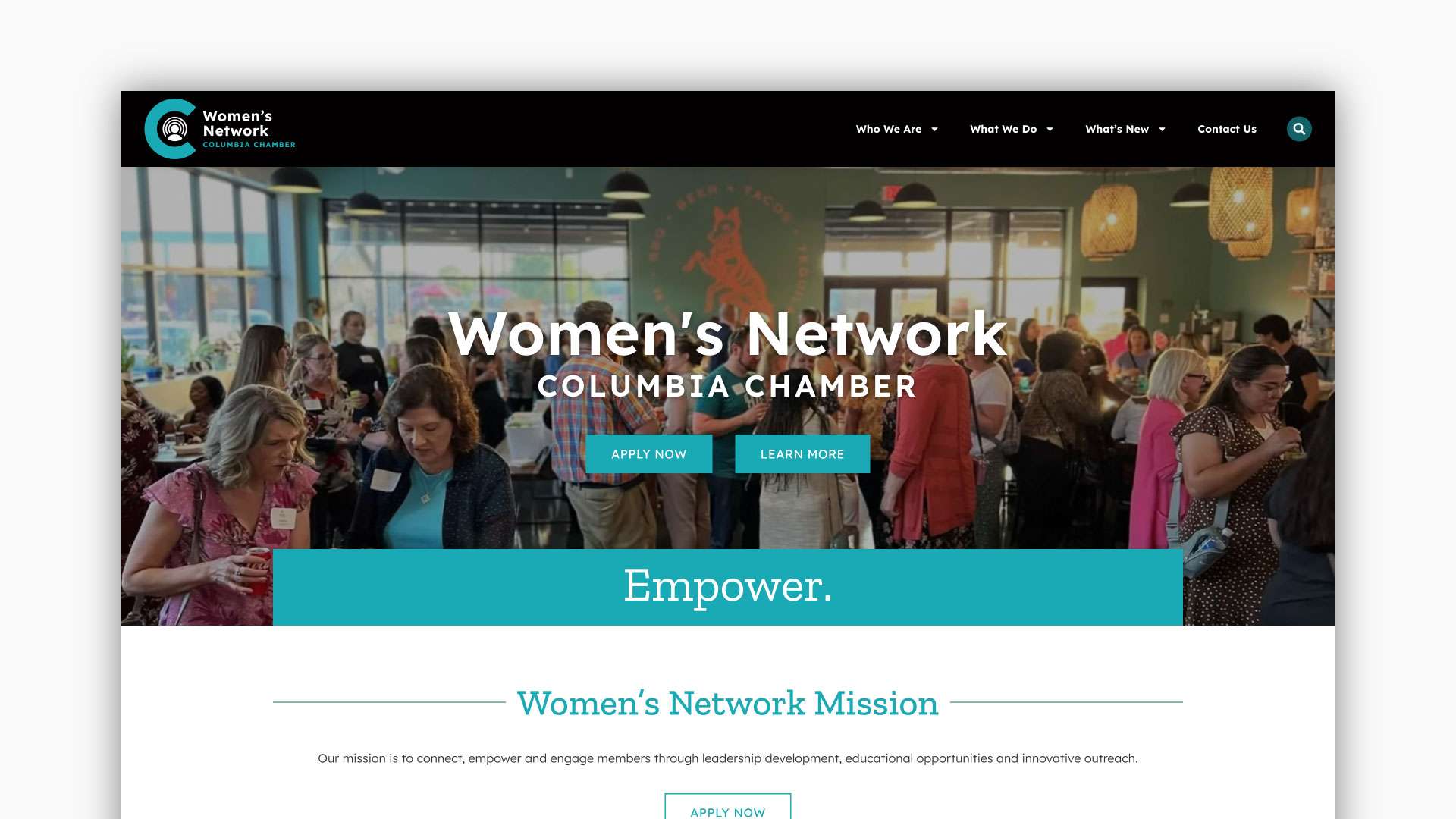
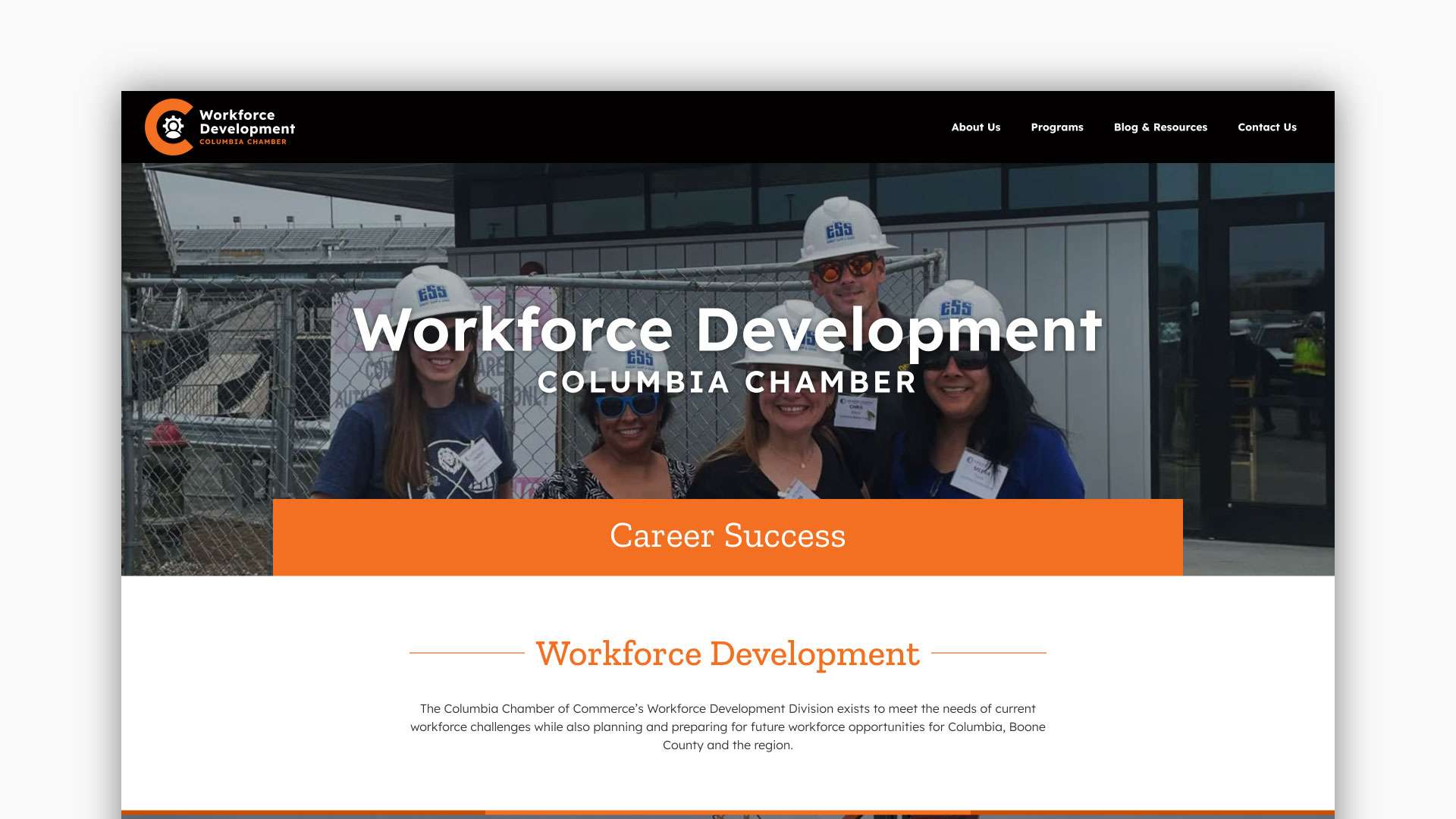
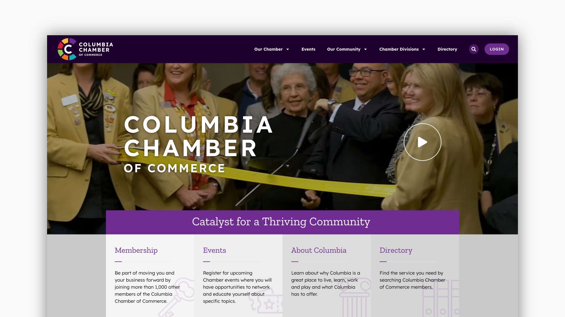
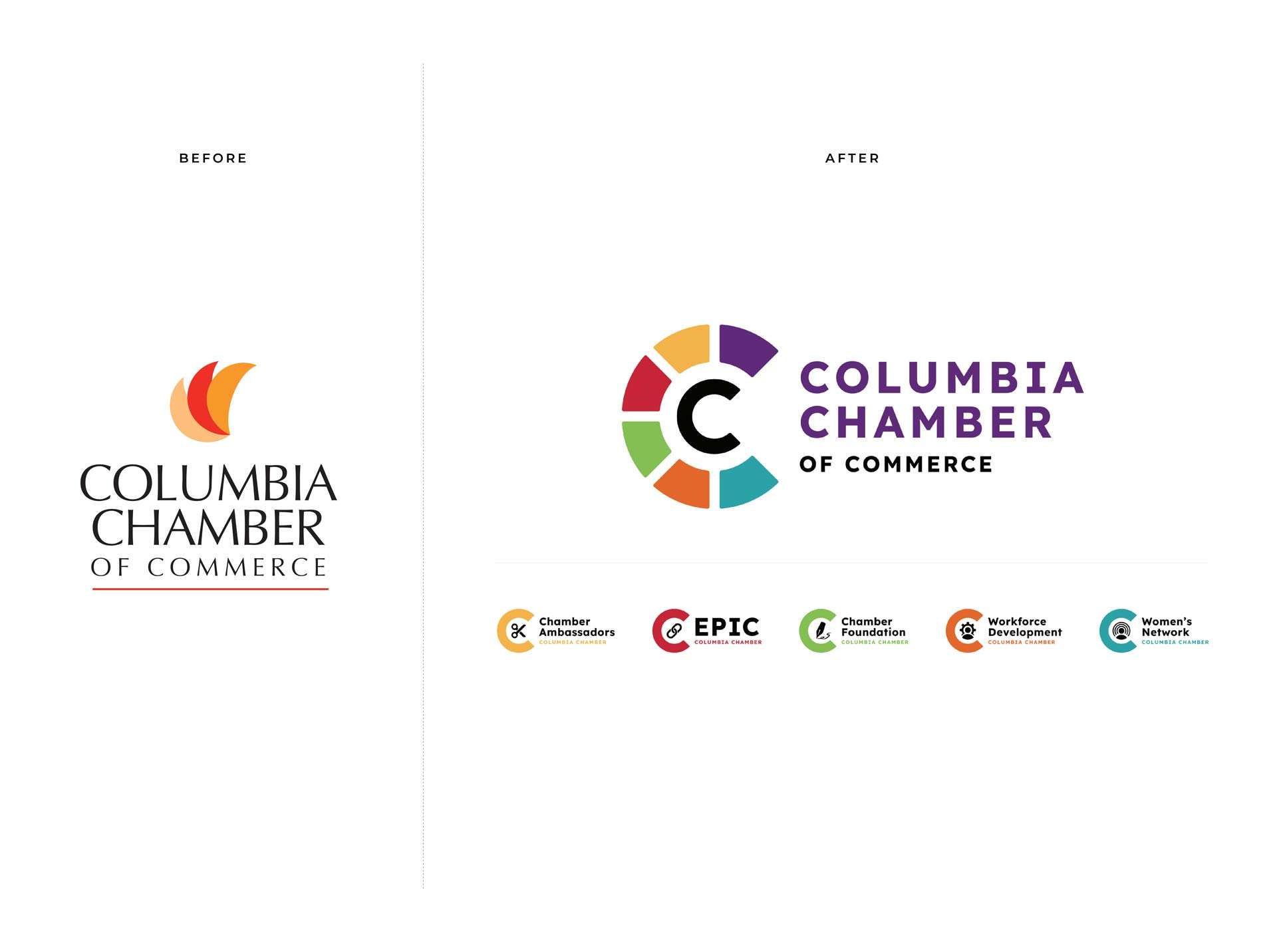
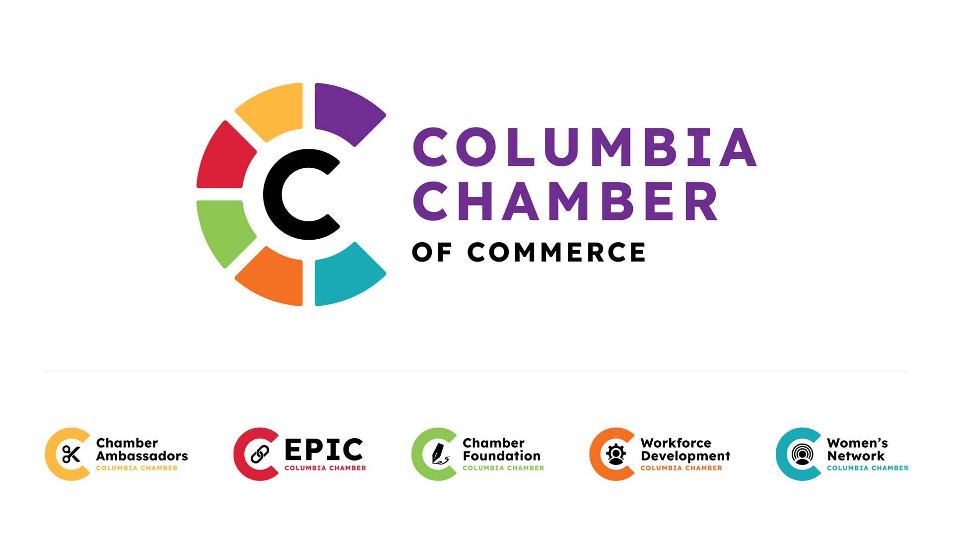
We had the pleasure of collaborating with the Columbia MO Chamber of Commerce board to revitalize their brand identity and enhance their online presence. Our comprehensive rebranding strategy involved developing a fresh, modern family of logos that better reflects the dynamic nature of the Chamber, it’s divisions, and its members. In addition to the rebranding, we designed and launched 4 new, user-friendly websites, equipped with features to improve member engagement and provide valuable resources for local businesses. The result was a cohesive and vibrant brand experience that positions the Chamber as a forward-thinking leader in the Columbia business community.
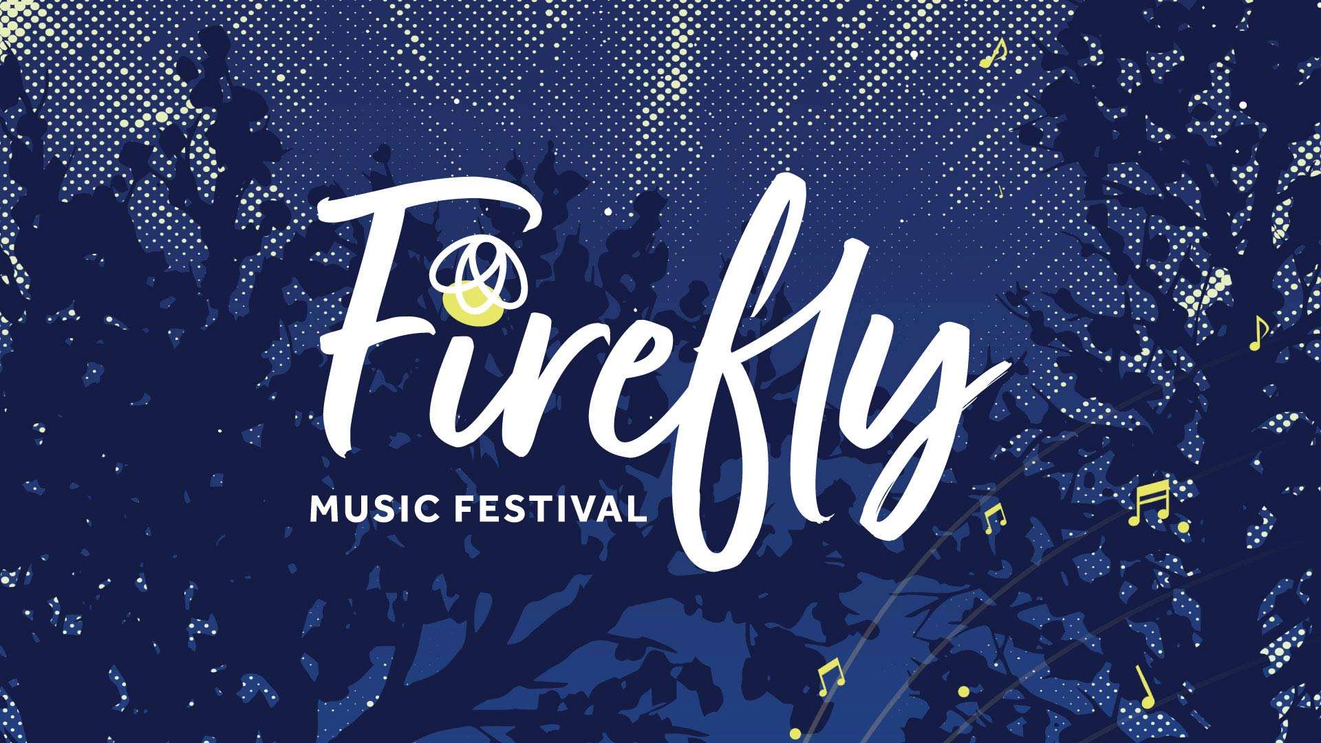
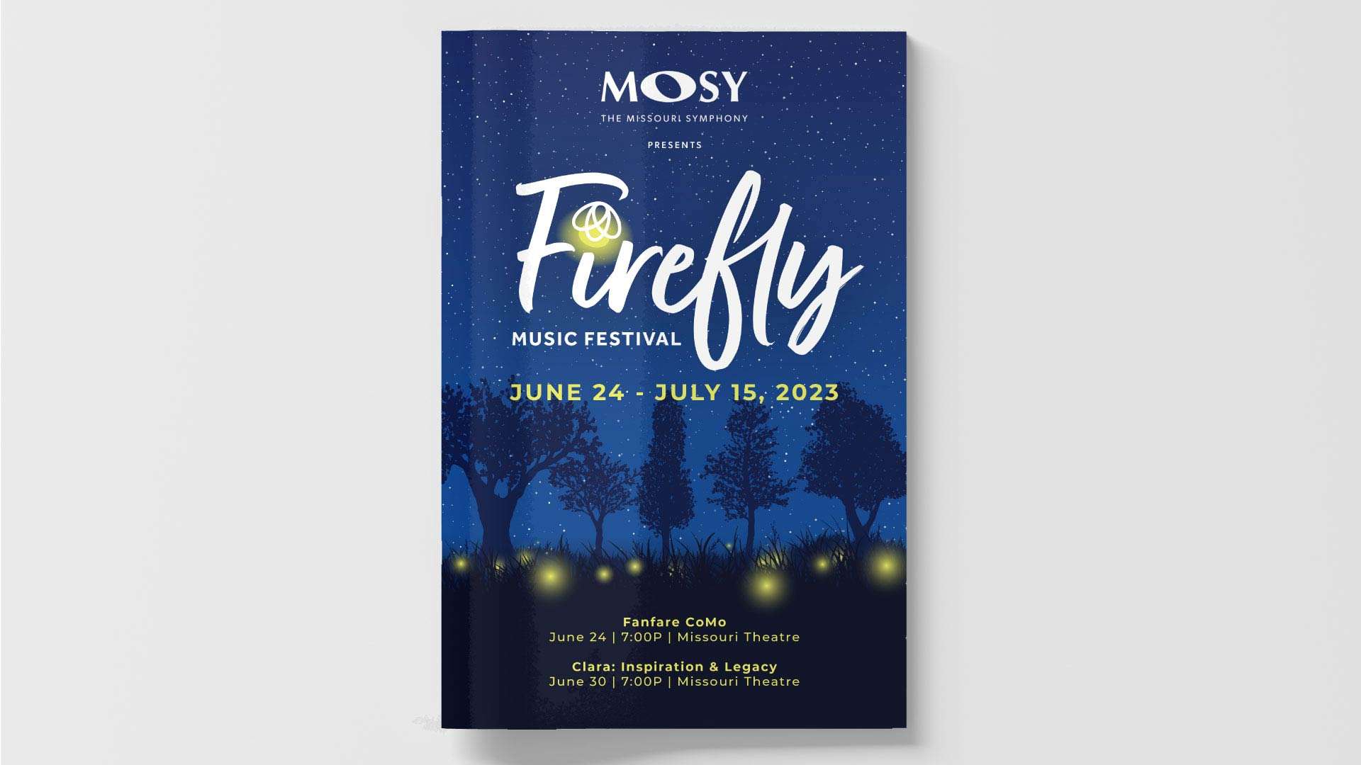
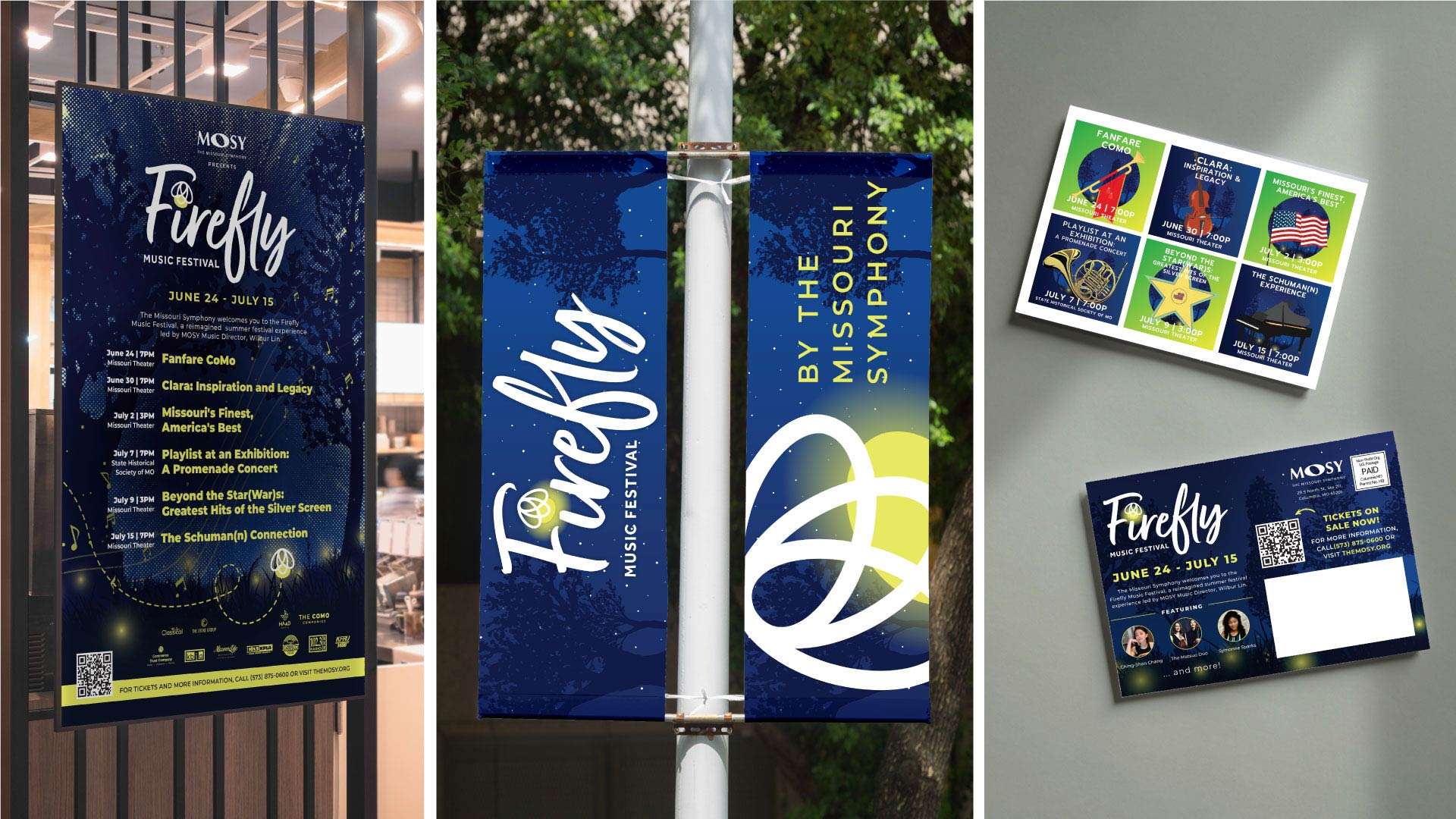
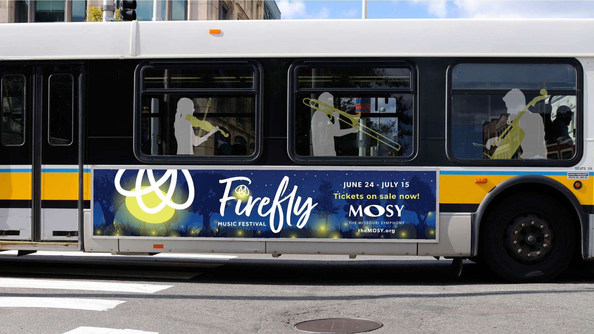
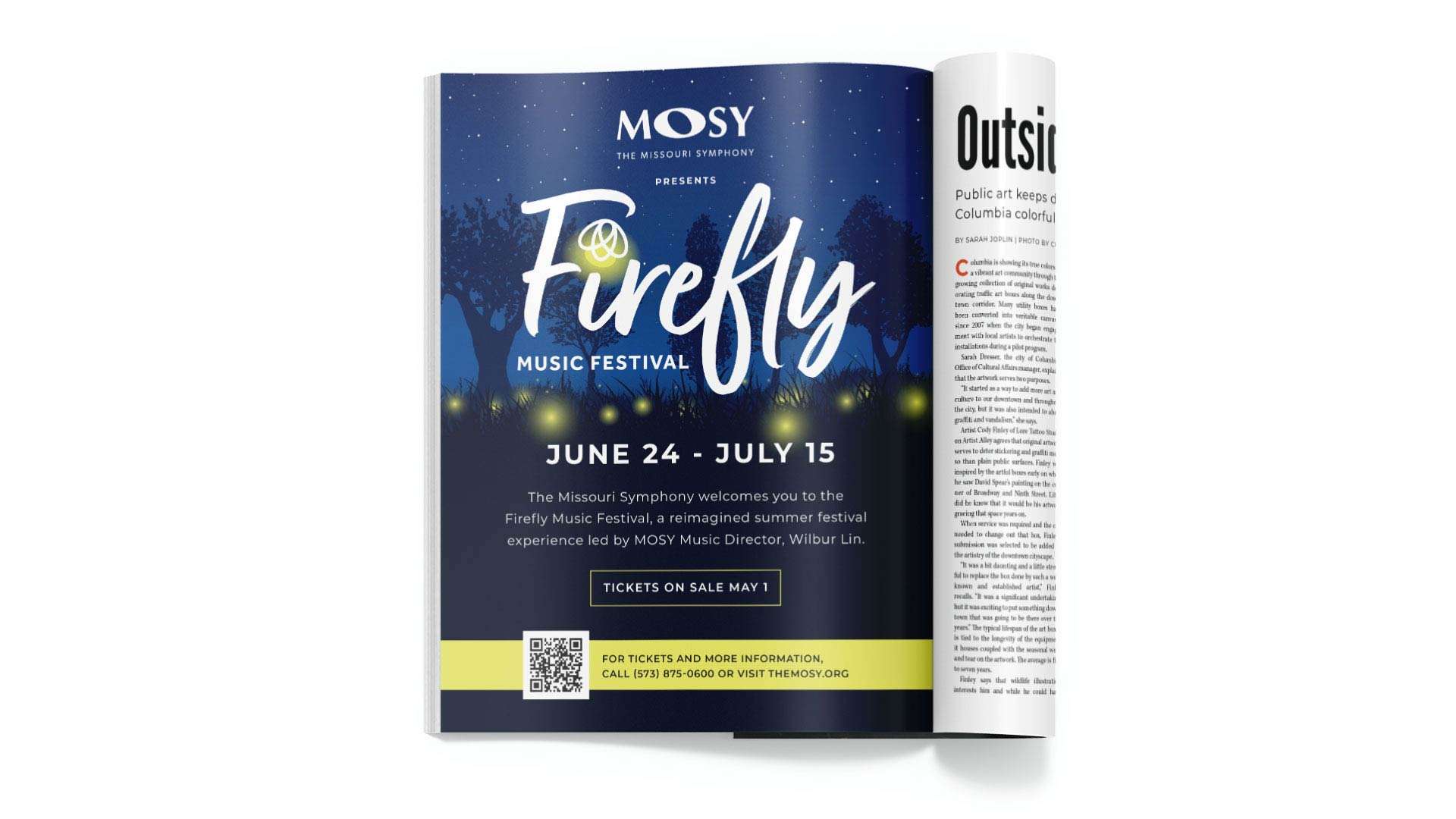
We had the pleasure of working with The Missouri Symphony (MOSY) to create the brand for their first ever Firefly Music Festival in 2023. Our deliverables included a captivating logo, mailers, advertisements, banners, bus ads, programs, posters, and lightpost flags. In addition to the festival branding, we also designed programs for multiple MOSY concerts and events. Our creative efforts helped MOSY establish a vibrant and memorable identity for the Firefly Music Festival, enhancing its visibility and appeal to a broad audience.
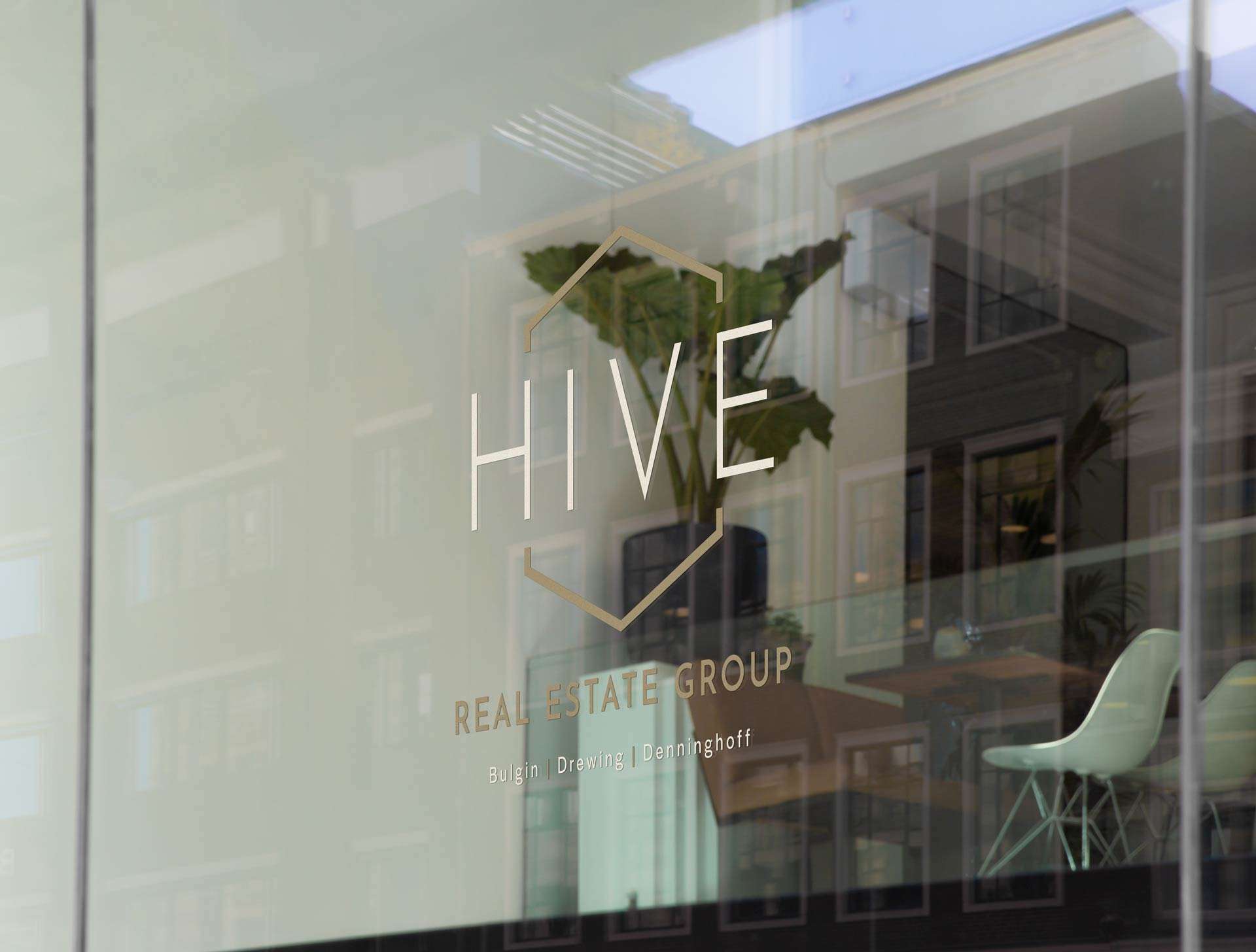
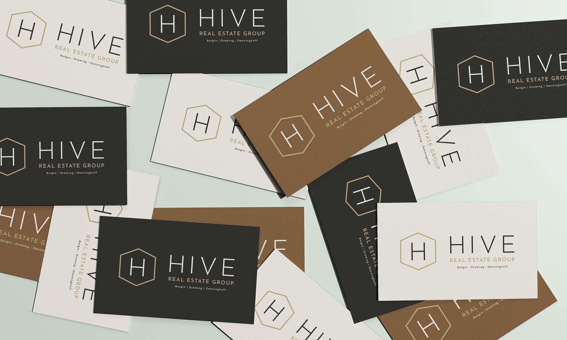
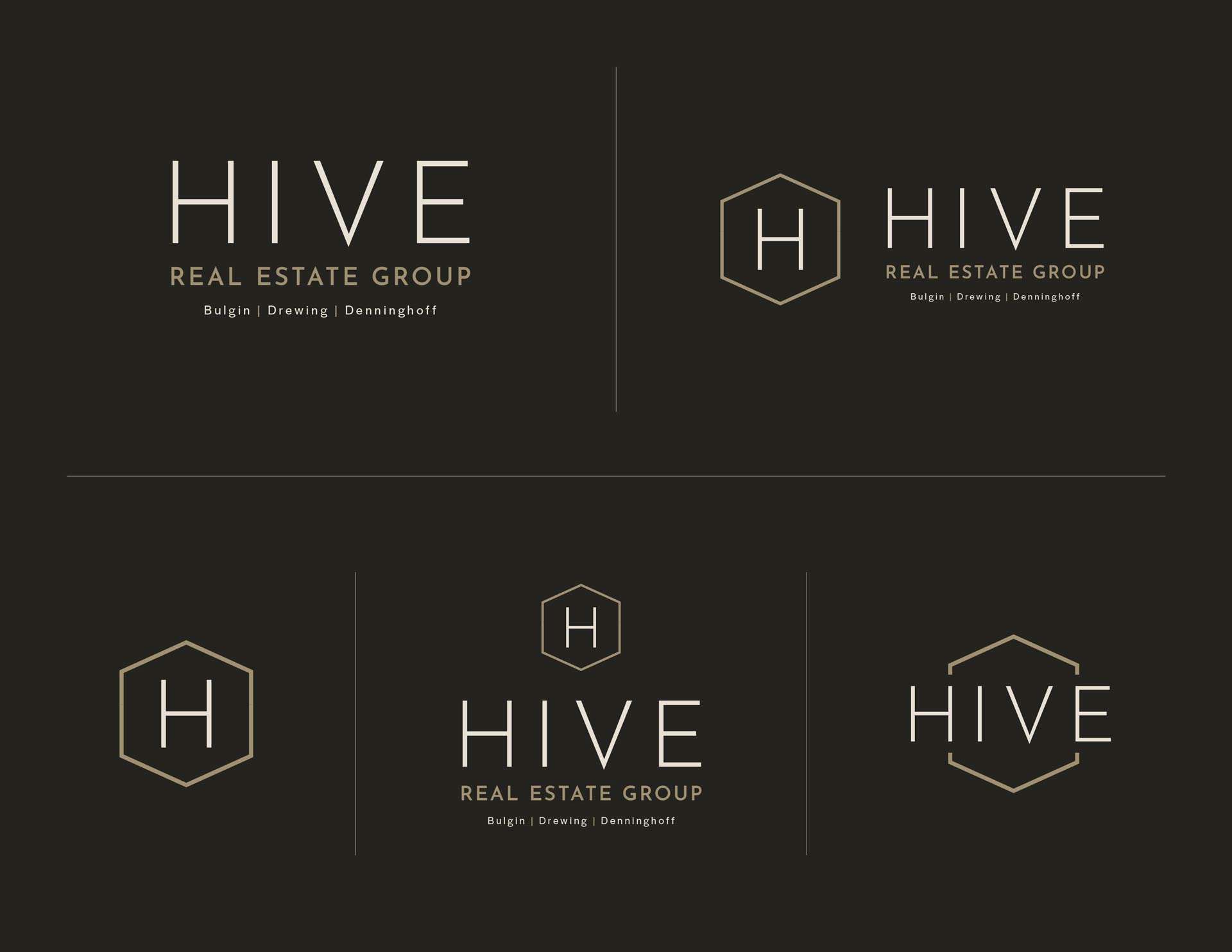
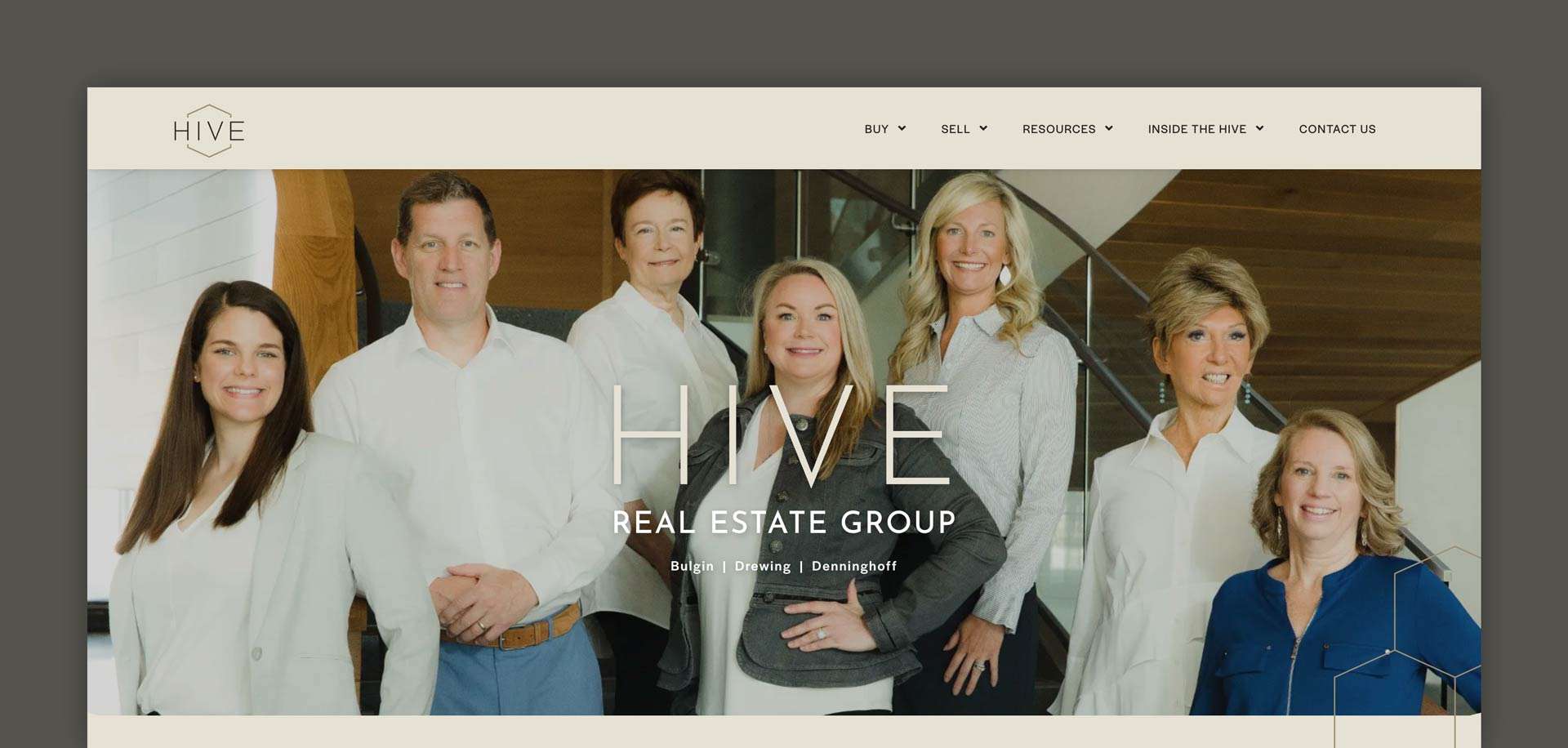
Working with HIVE on their branding and new website was an exciting and rewarding experience. The goal was to create a modern, user-friendly site that reflected their professional, approachable image. We collaborated closely to refine their branding, focusing on clean lines, an elegant color palette, and messaging that emphasized trust and expertise.
The website redesign incorporated intuitive navigation and high-quality visuals, ensuring a seamless experience for potential buyers and sellers. The final product successfully showcased the client’s unique strengths while enhancing their online presence and boosting engagement with their target audience.
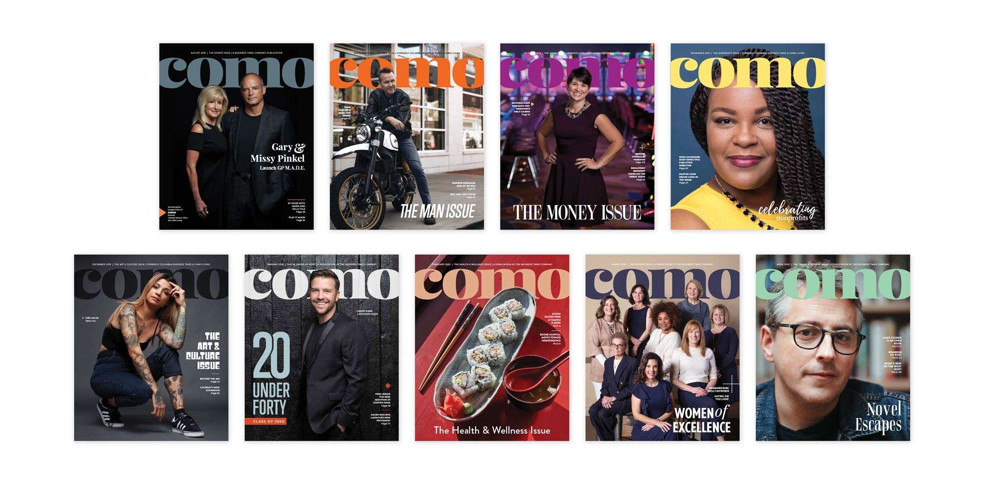
When we were given the opportunity to merge our two publications, Columbia Business Times and COMO Living and launch a completely new magazine, it felt different than other rebranding projects.
We had spent years developing these brands, building the reputation and resources that allowed them to become beloved sources of connection and entertainment. We knew their strengths – and their weaknesses. COMO was our chance to not only bring together our audiences but to speak to an entirely new population that had previously never picked up our magazines. Because of this, our new publication needed to be more than just the best parts of the two existing magazines.
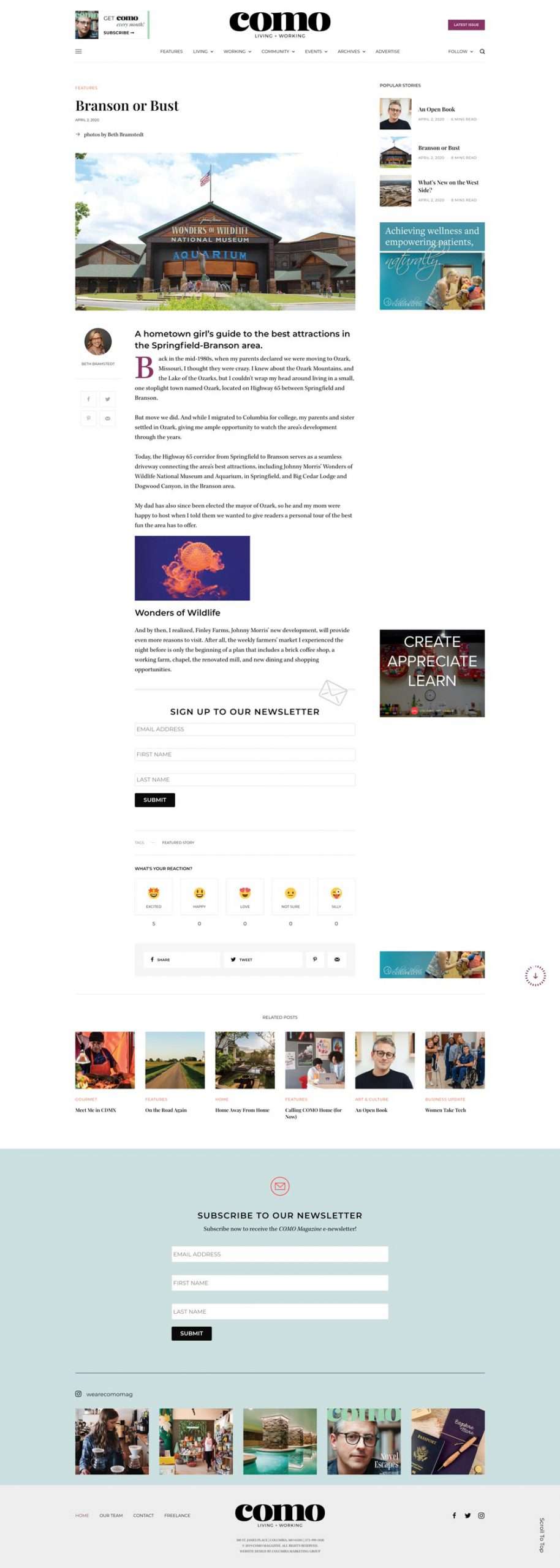
Our goal for COMO was to reflect the Columbia of today, and ultimately how it will grow and evolve. The brand is relevant, inclusive, adaptable and most importantly — personal. We tell a wide range of stories; from a journalistic report on how new regulations are affecting local business, to an intimate portrait of a family dealing with a terminal illness, to a field guide on the best adventurous day trips in our areas. COMO is able to tell the stories of any pocket of our community, while still retaining an identity that gives our editorial team the ability to write stories that are distinctly Columbia and distinctly COMO.
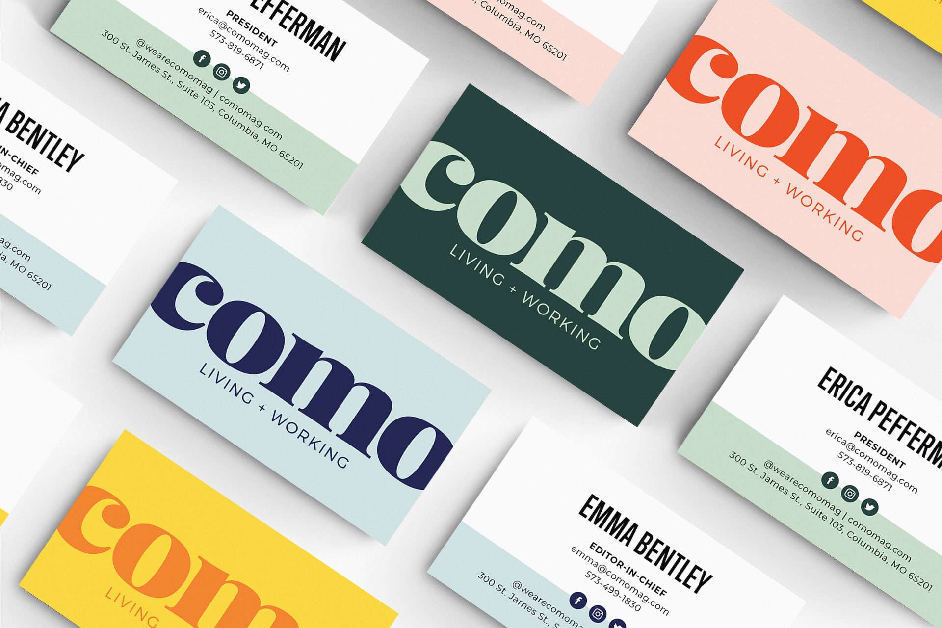
The core color-combos of monochromatic pink, green and blue gave the brand a distinct tone for our launch and the accompanying merchandise and graphics, while our full-spectrum ROYGBIV color palette allows us the flexibility to adapt our designs to the editorial voice.
Typography is a fundamental aspect of any magazine. When it came to selecting fonts, we spent weeks agonizing over every little detail. From legibility to weight distribution, glyph libraries, web availability, and general compatibility – eventually we ended up with a family of typefaces that allows us to adapt our designs to any content thrown our way.
Once we had our new brand personality in place, we still had to design the new publication from scratch! In order to establish the structure the magazine needed, it required a strong brand foundation (check!), and a vast design system of guidelines and best practices allowing our structure to ebb and flow as content changed from issue to issue. To establish these best practices, we allowed the content to inform our design decisions. We built out templates, plugged in archives of past content, addressed frustrations of previous templates, and adjusted until we had the parameters we were confident gave us the flexibility needed. Once we had the skeleton built, we were able to use the brand we had established and sprinkle in some personality to really bring the content to life.
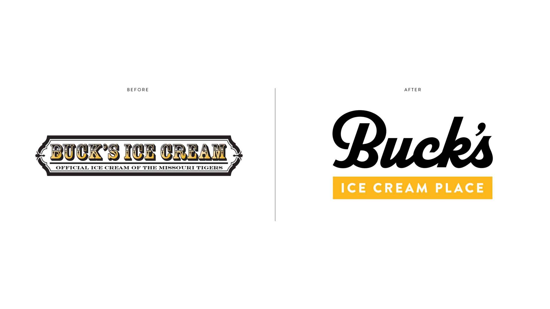
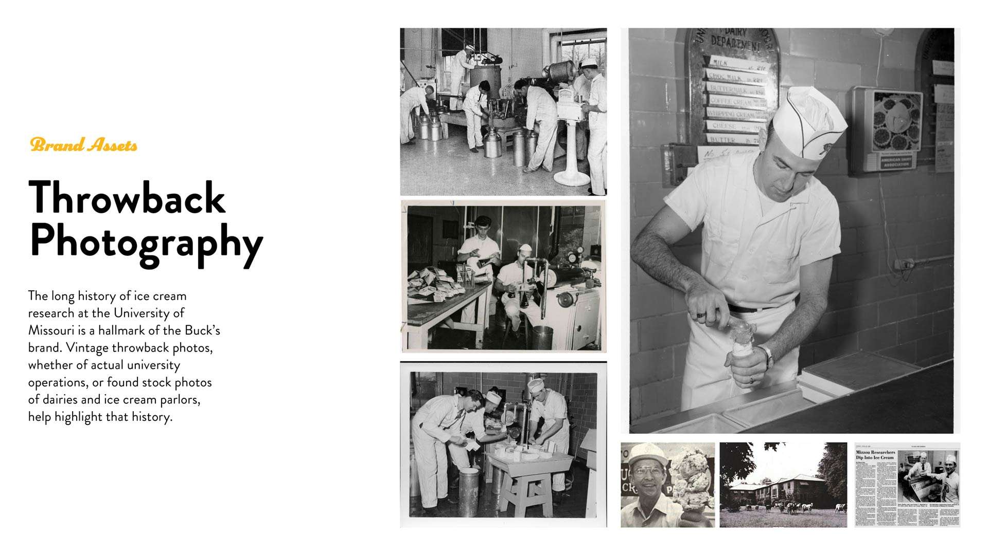
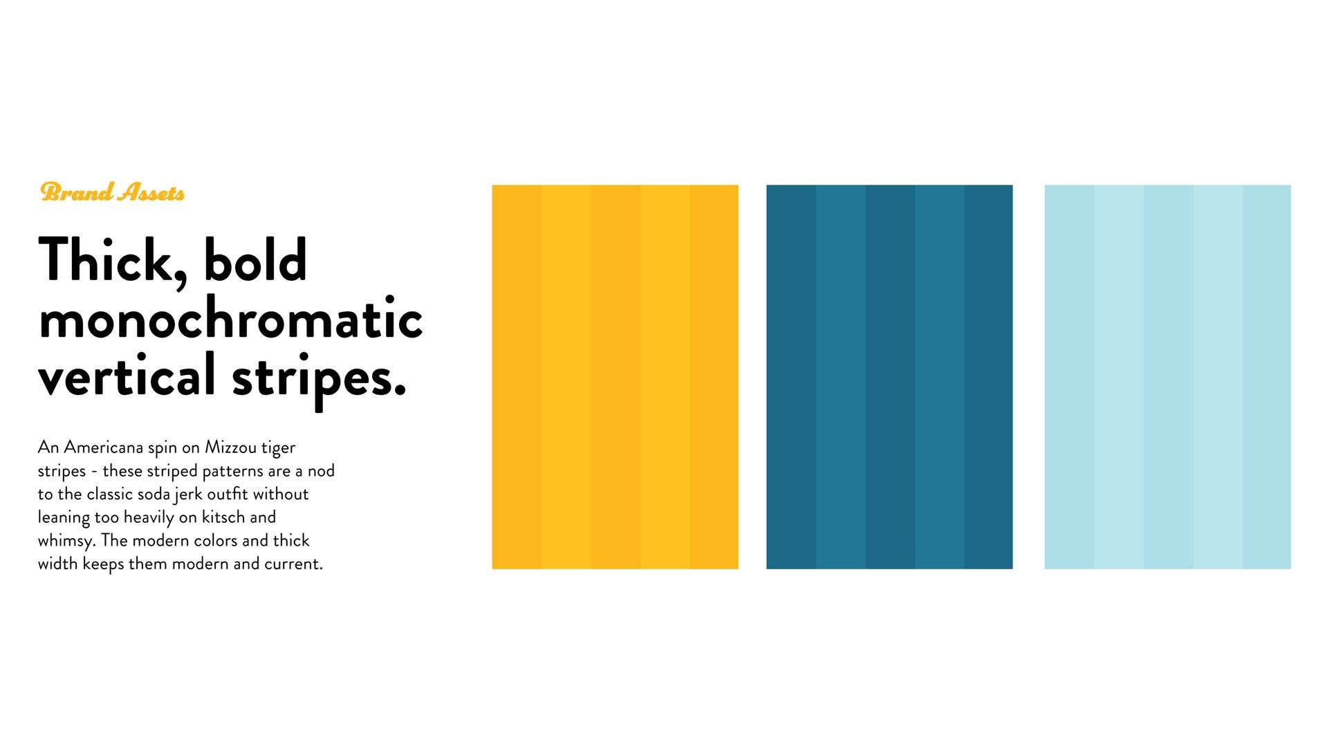
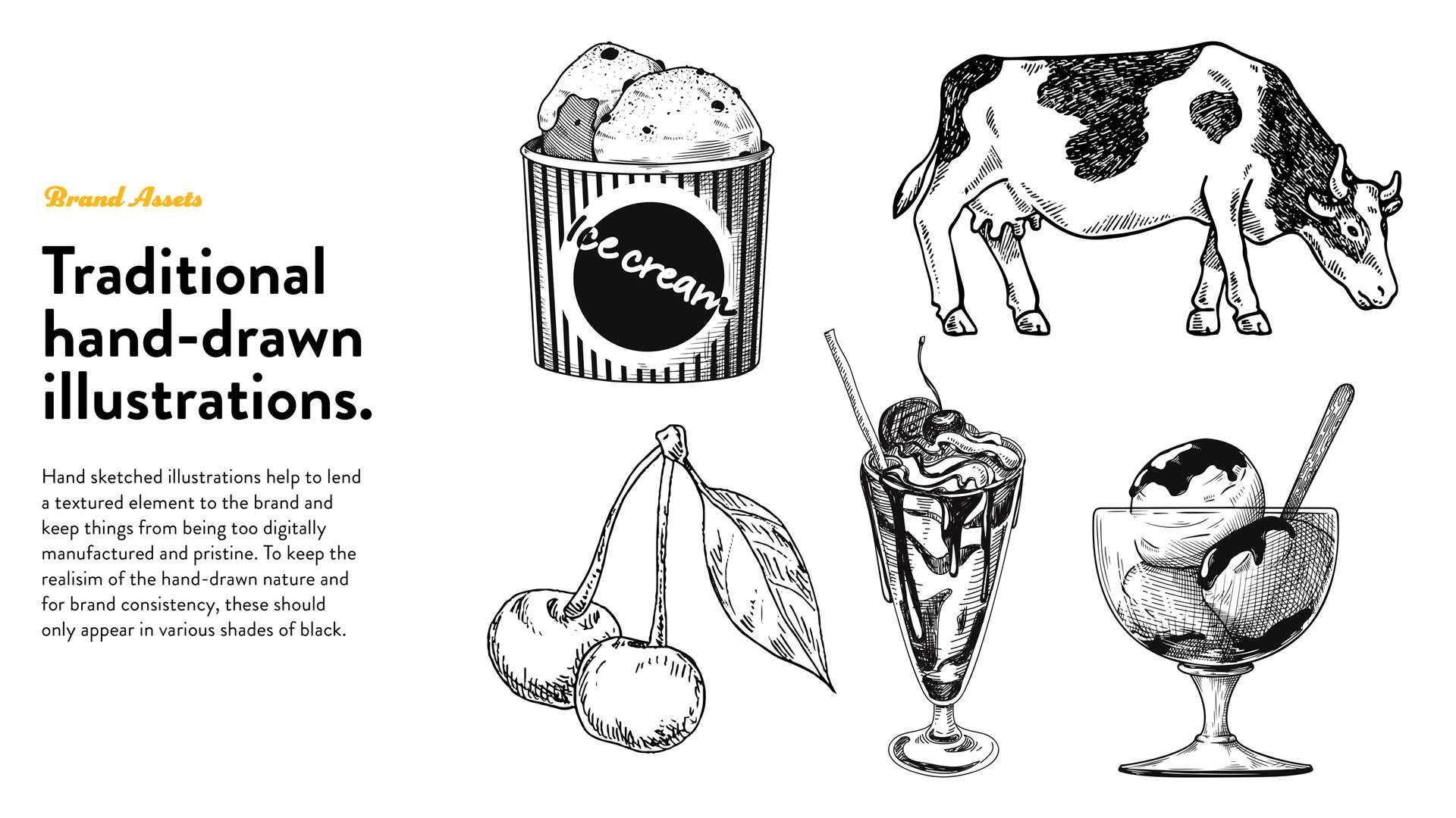
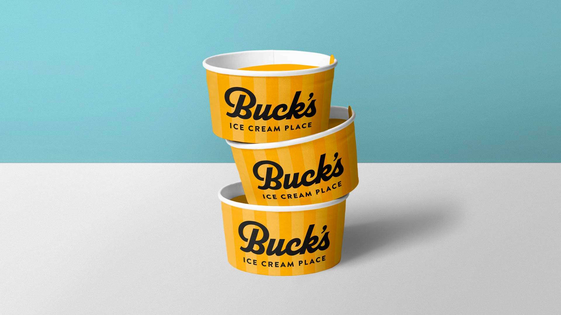
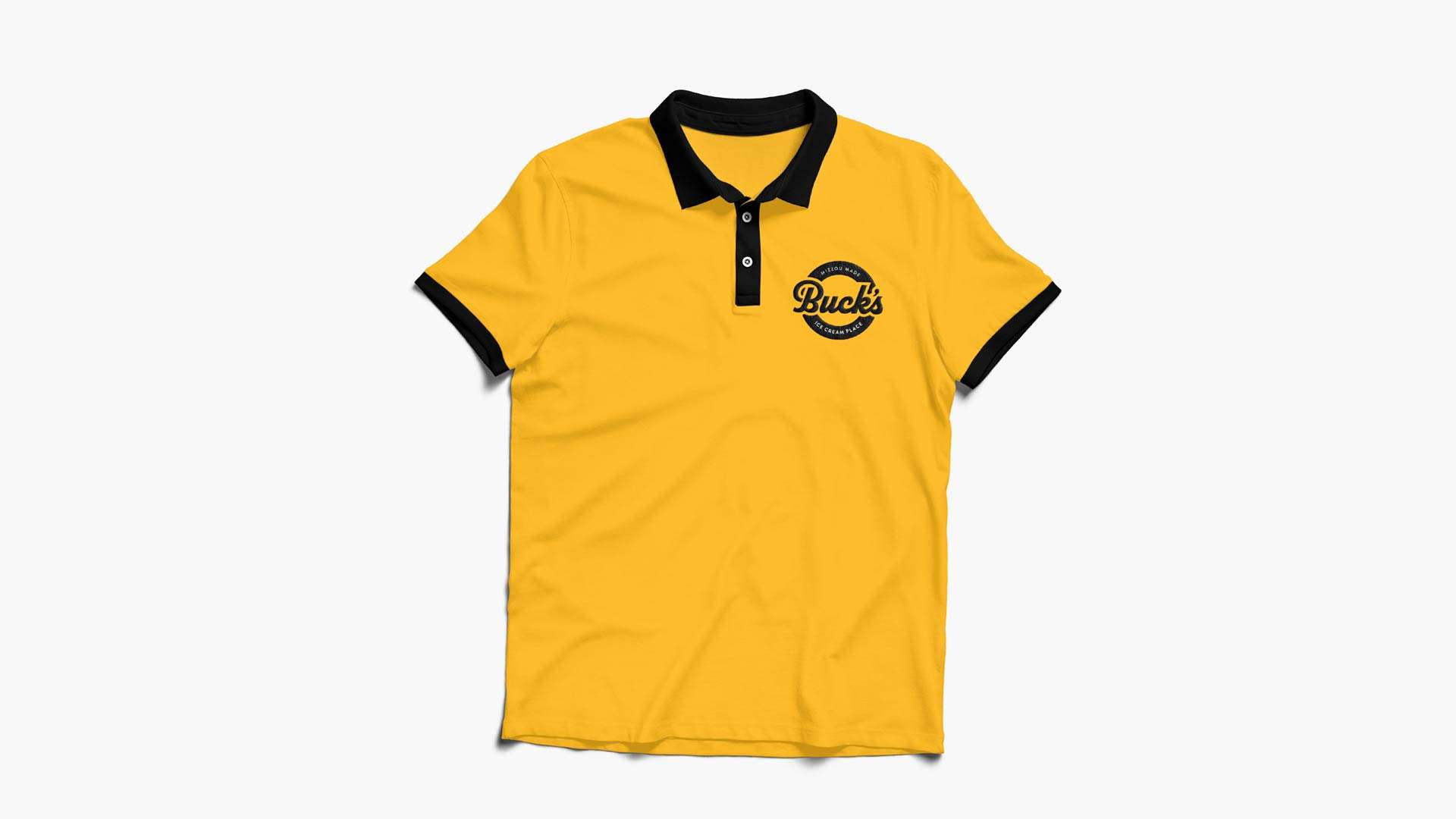
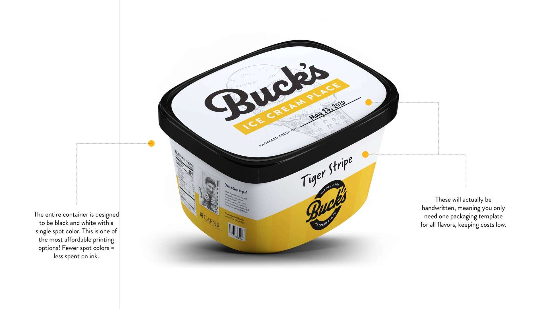
We partnered with Buck’s Ice Cream Place, a beloved institution at the University of Missouri, on a rebrand that honors their rich history while embracing a modern polish. As both a hands-on teaching laboratory for food science students and a cherished campus staple, Buck’s represents a legacy of craftsmanship and innovation. Guided by the Arbuckles’ enduring contribution to ice cream research, we subtly incorporated visual nods to classic ice cream parlors along with vintage elements, while keeping the look fresh and modern. The result is a brand that celebrates its history while looking toward the future—remaining a symbol of Mizzou pride enjoyed by students and alumni alike.